
components
Button
v.1.0.0 | Saturn Storybook
Interactive element that, upon being pressed, triggers a specific action.
Component
Play with the component with our playground.
Anatomy
Primary

| Name | Description |
|---|---|
1 Required | width height |
2 Required | Typically blue in color and used for general information. |
3 | It helps to quickly understand the meaning of the action. |
4 | It helps to quickly understand the meaning of the action. |
Secondary

| Name | Description |
|---|---|
1 Required | Typically blue in color and used for general information. |
2 | It helps to quickly understand the meaning of the action. |
3 | It helps to quickly understand the meaning of the action. |
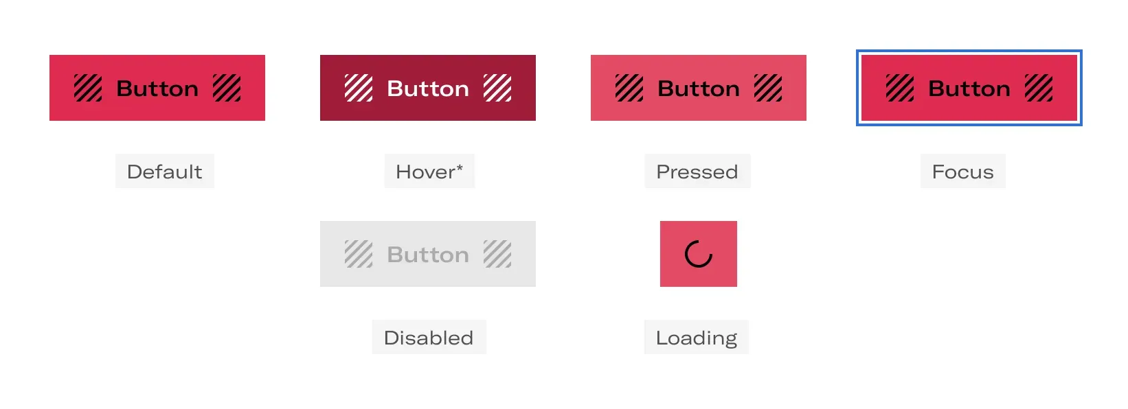
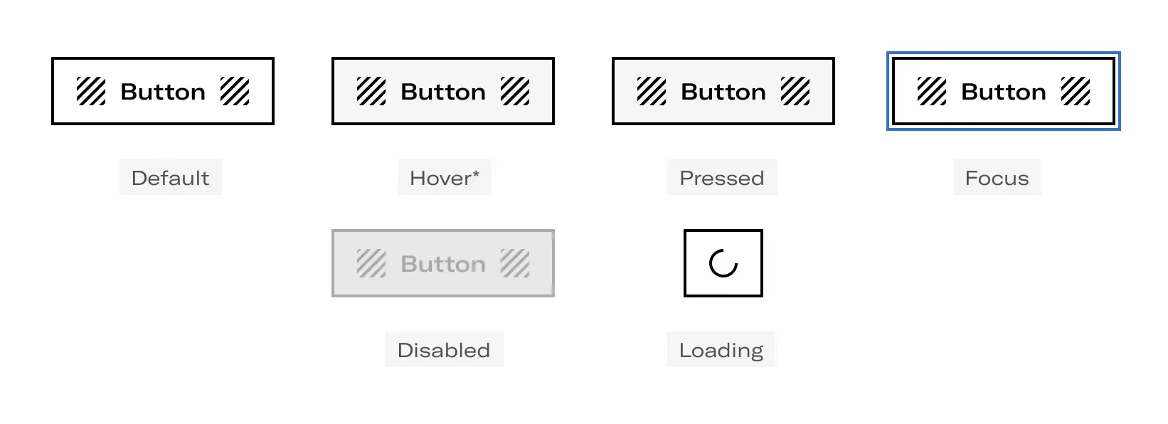
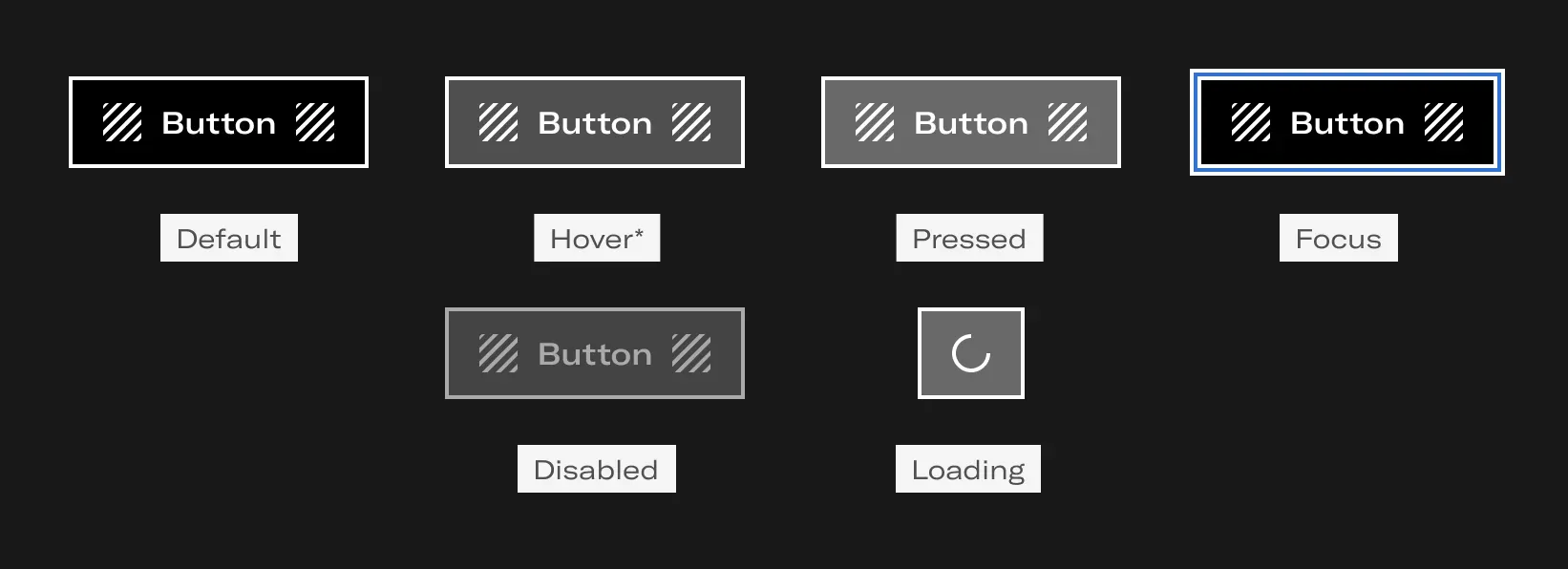
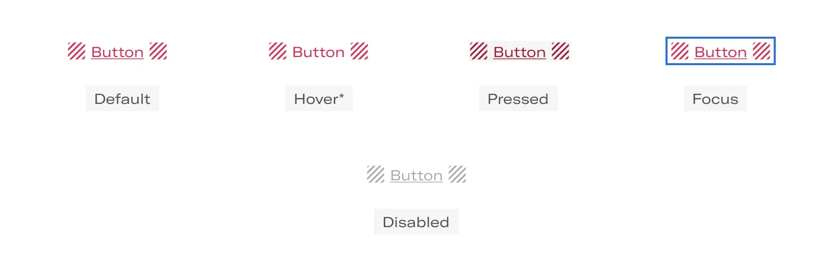
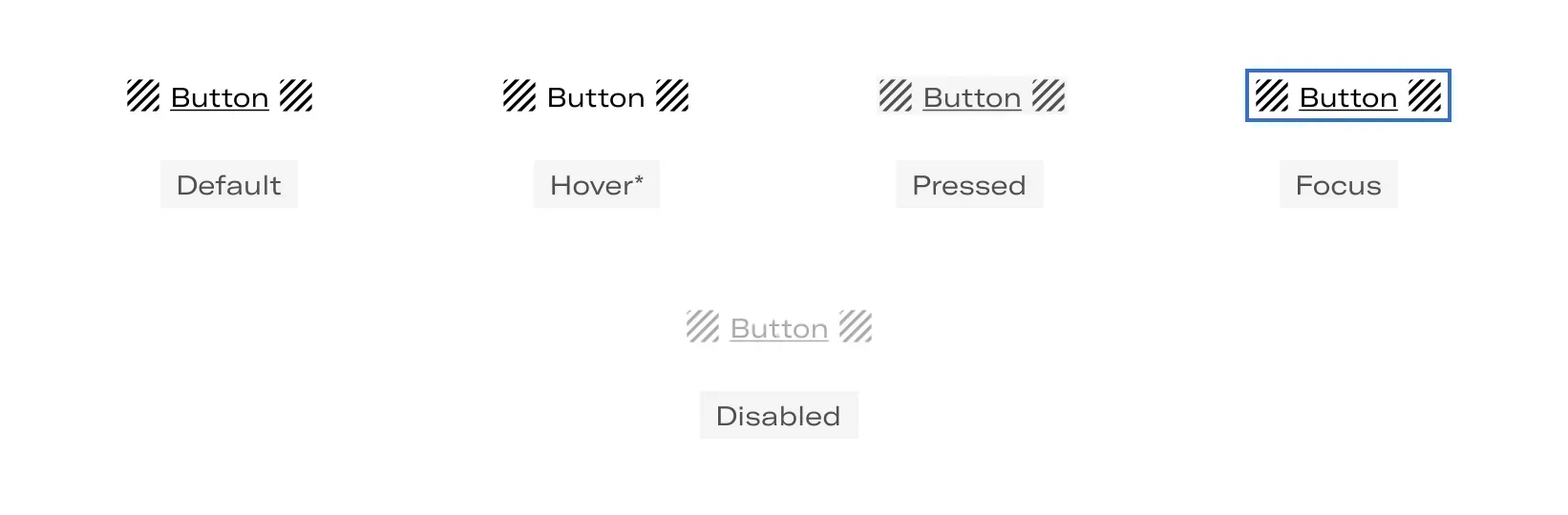
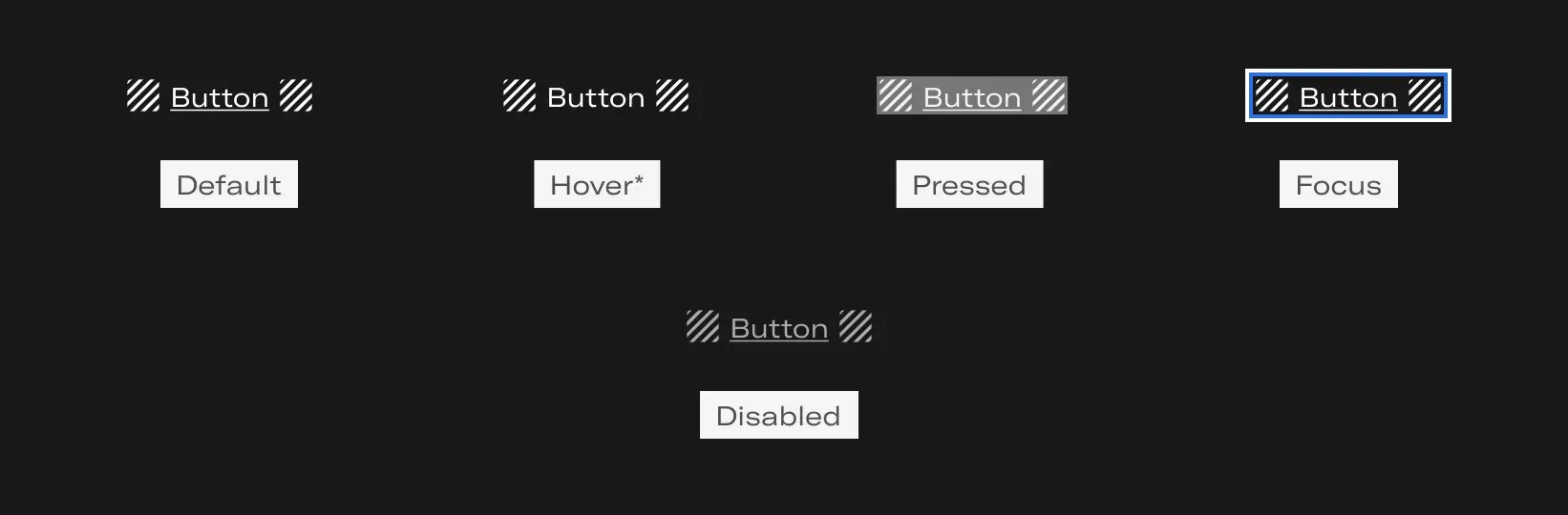
States and Variants
- Default: A default state communicates an interactive component or element.
- Hover: A hover state communicates when a user has placed a cursor above an interactive element. This state only will be applied in desktop.
- Pressed: A pressed state communicates a user clicks or taps.
- Keyboard focus: A keyboard focus state communicates when a user has highlighted an element, using an input method such as a keyboard or voice.
- Disabled: A disabled state communicates a noninteractive component or element.
- Loading: A loading state indicates that a quick progress taking place (e.g., saving settings on a server). In this case, the label and optional icon disappear and a progress circle appears. The progress circle always shows an indeterminate progress.
Button
- Primary
- Secondary
- Secondary alternative
Action
- Primary
- Secondary
- Secondary alternative
Options
- No icon
- Left icon
- Right icon
Layout
- Vertical grouping
The buttons occupying the total of the grid and they can be placed on top of each other.

- Horizontal grouping
The buttons can stretch their width if necessary as in the case of footers on mobile, occupying the total of the grid.

- Natural growth
The buttons grow horizontally embracing the text they contain.

- Full width
The buttons can stretch their width if necessary, as in the case of the footer in mobile, occupying the entire grid.

Do's and dont's

Do’s
Use buttons according to the level of importance of the button action.

Don’t

Do’s
You can use the icon options when you deem necessary.

Don’t
Do not use buttons with two icons, it saturates the user experience.