
components
Action bottom sheet
v.1.0.0 | Saturn Storybook
Floating panel that displays additional action-related content. It appears near the component that triggers its activation.
Components & Variants
Play with the component with our playground.
Anatomy

| Name | Description |
|---|---|
1 Required | Background color may vary according to design needs. width height |
2 Required | There must be a content to use this component. Always with a inner padding of 24px. |
3 | Indicates information about the Action Bottom Sheet. The title can grow depending on the copy or the size of the typography. |
4 | Describes the action that the user is going to do. |
Behaviour
Desktop
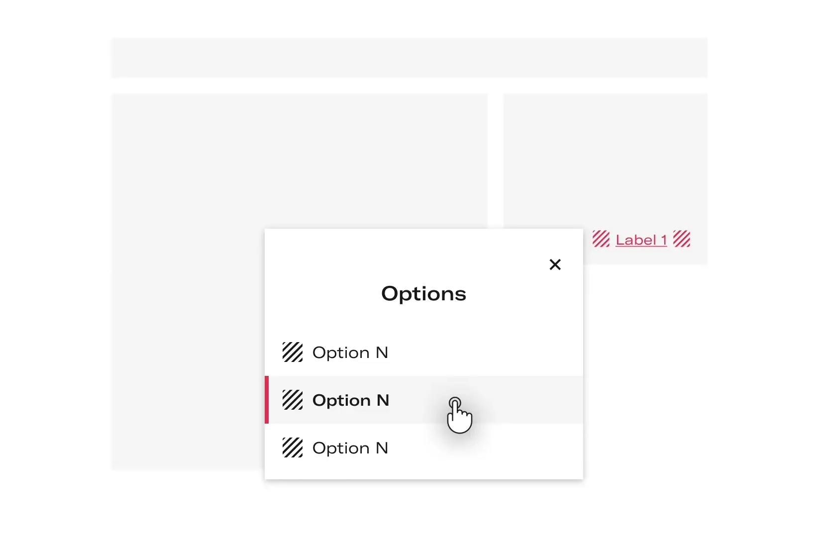
- Activate the Action Bottom Sheet
When the user clicks on an element that activates it (like a Button), the Action Bottom Sheet appears.
icon
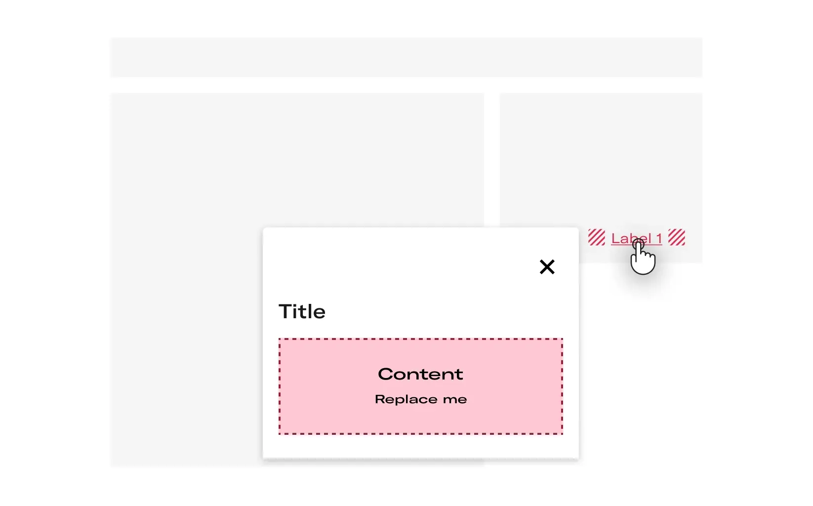
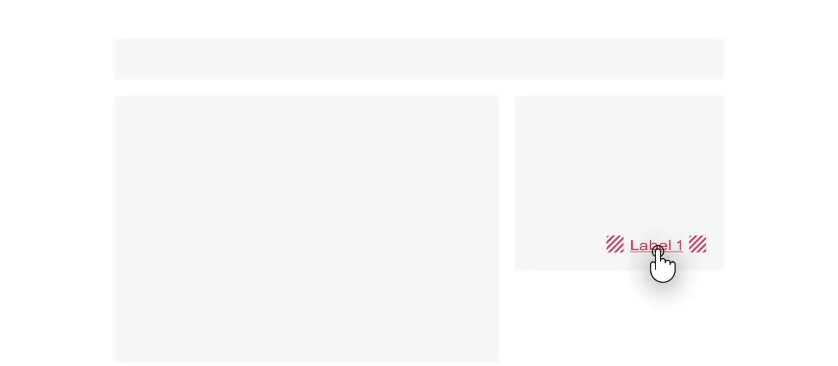
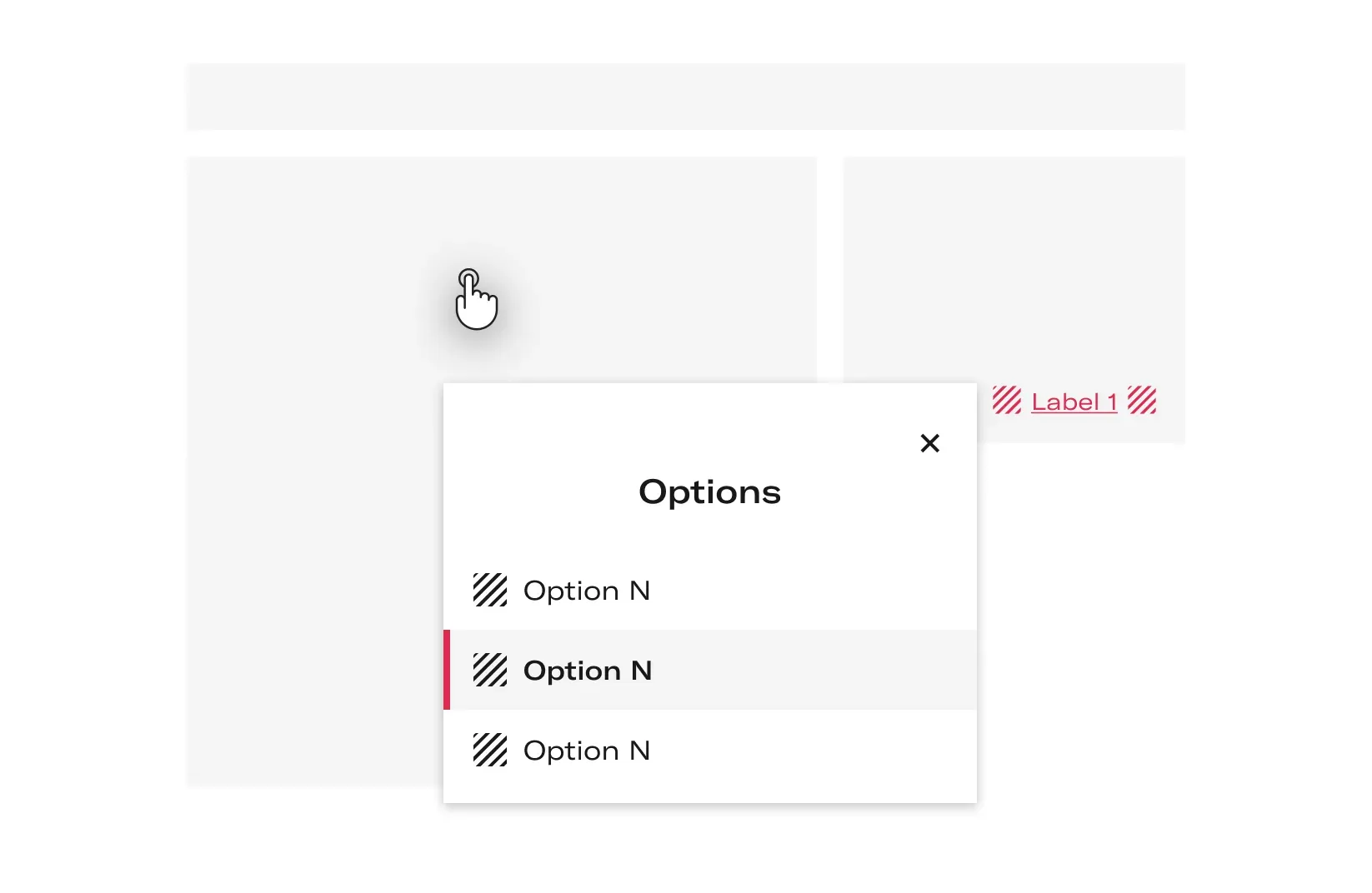
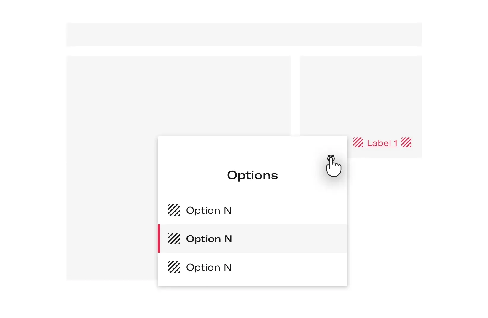
- Close the Action Bottom Sheet
The user can close the Action Bottom Sheet by selecting any item from the list, clicking the surfaces behind the dialog or the Close Button.
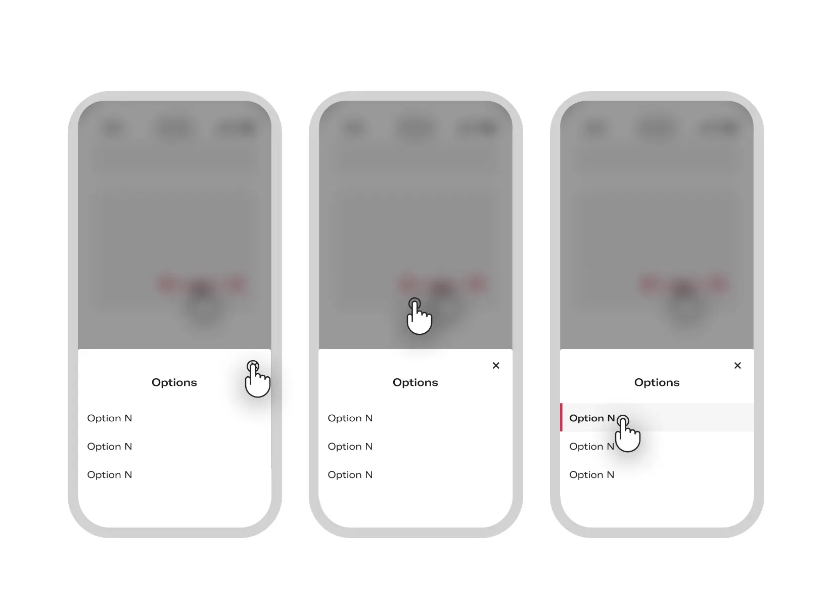
Mobile
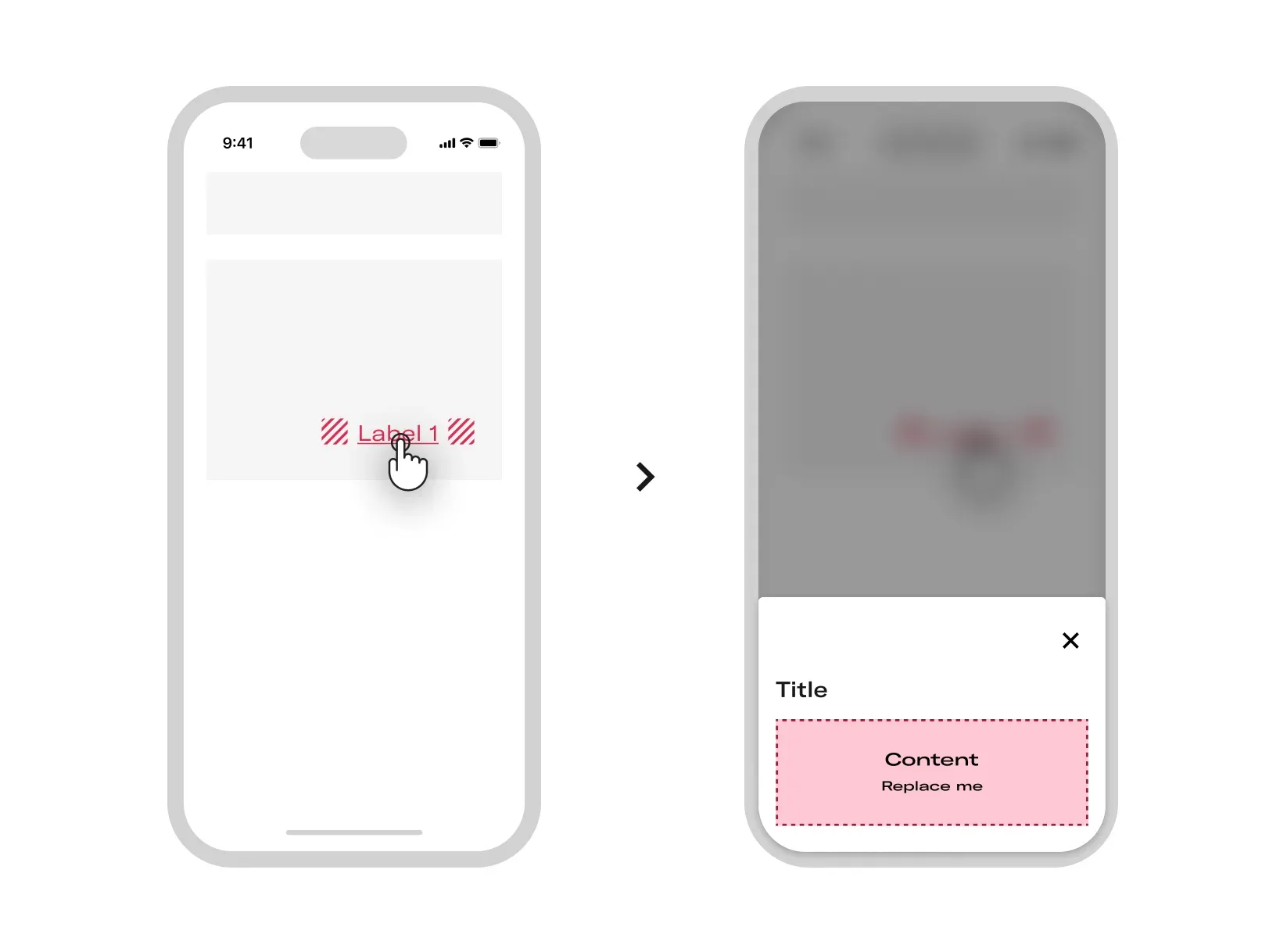
- Activate the Action Bottom Sheet
When the user clicks on an element that activates it (like a Button), the Action Bottom Sheet appears.
- Close the Action Bottom Sheet
The user can close the Action Bottom Sheet by selecting any item from the list, clicking the surfaces behind the dialog or the Close Button.
Layout
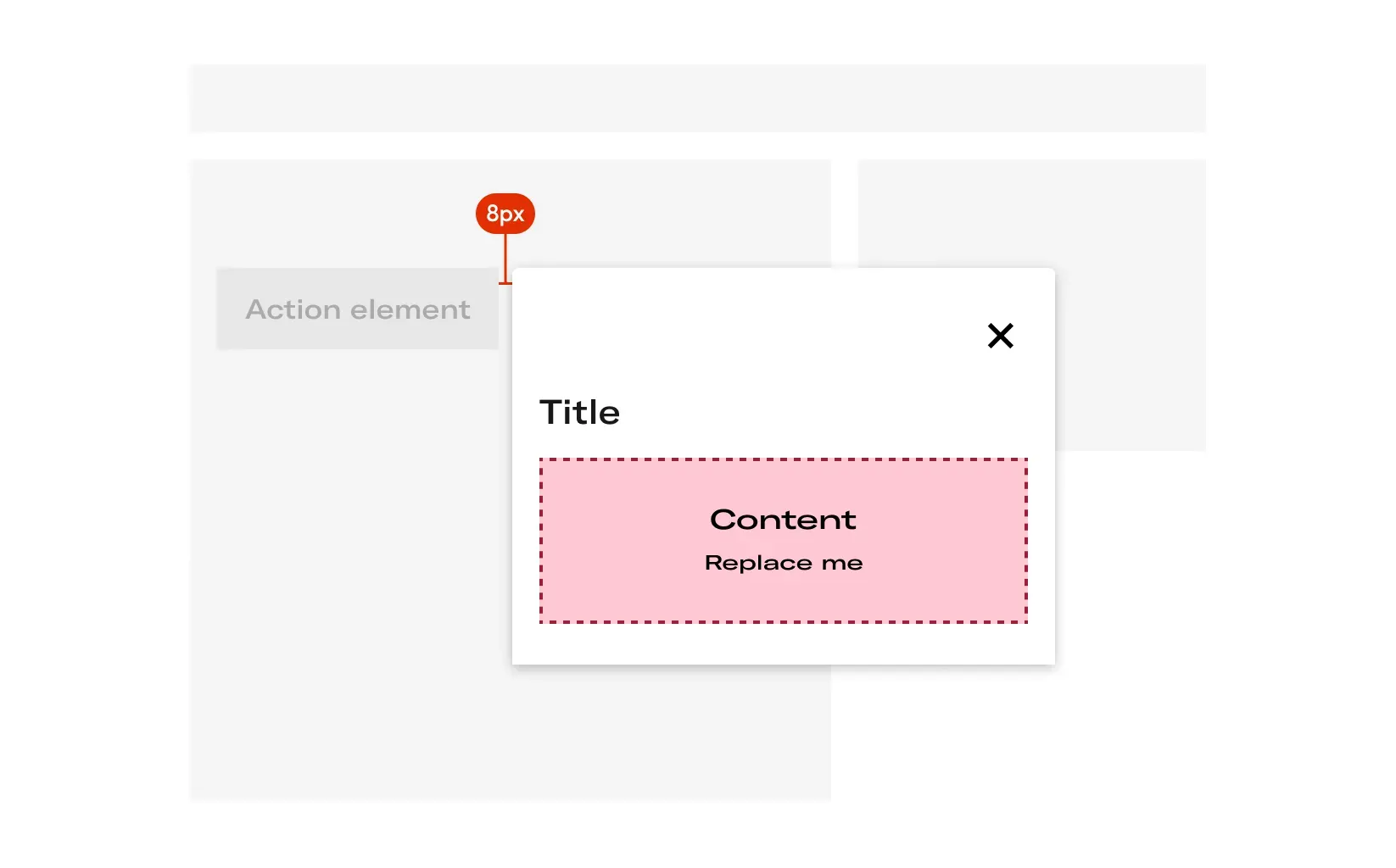
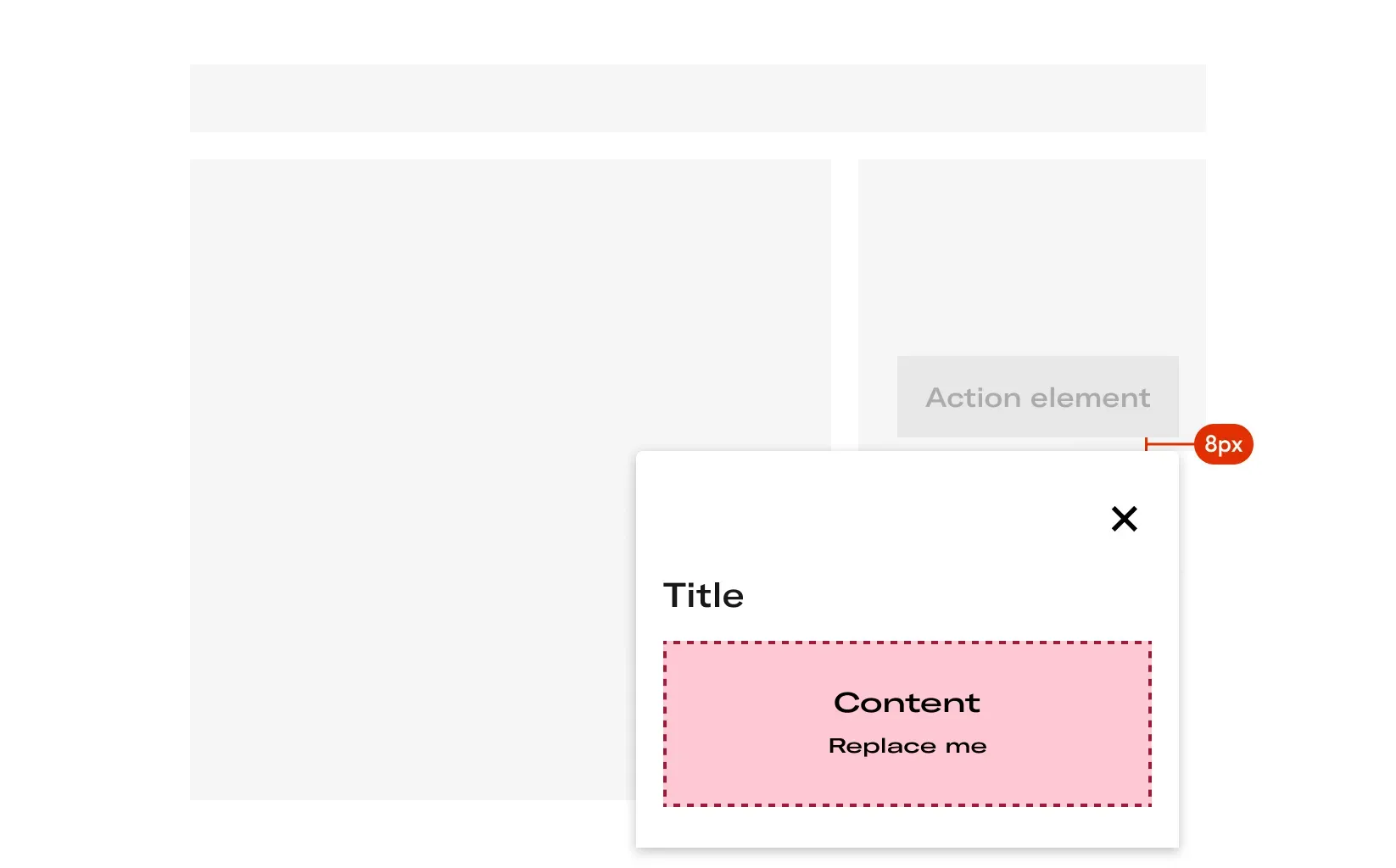
- Activate the Action Bottom Sheet
When the user clicks on an element that activates it (like a Button), the Action Bottem Sheet appears. The margin space between de trigger element and the Action Button Sheet must be 8 px.