
components
Modal
v.1.0.0 | Saturn Storybook
Floating layer over the current page use for capturing the user's attention in order to inform of force to make an action.
Component
Play with the component with our playground.
Anatomy

| Name | Description |
|---|---|
1 Required | width height left-radius right-radius |
2 Required | Indicates information about the Drawer. The title can grow depending on the copy. |
3 Required | It can contain different types of content such as tables, lists... |
4 | Illustration has to be 120px in height. |
5 | It helps to quickly understand the meaning of the action. It will be shown except when user is in the second level or is a blocking modal. |
6 | It is required to make actions. |
7 | Layer with transparency to the whole view. |
Behaviour
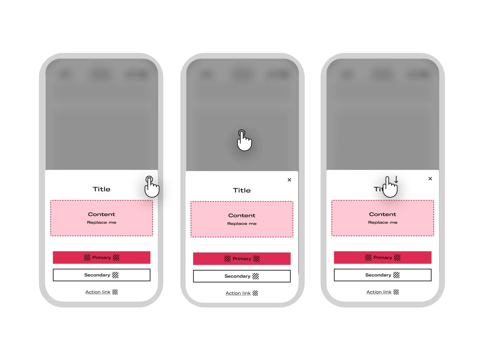
- How to close the modal
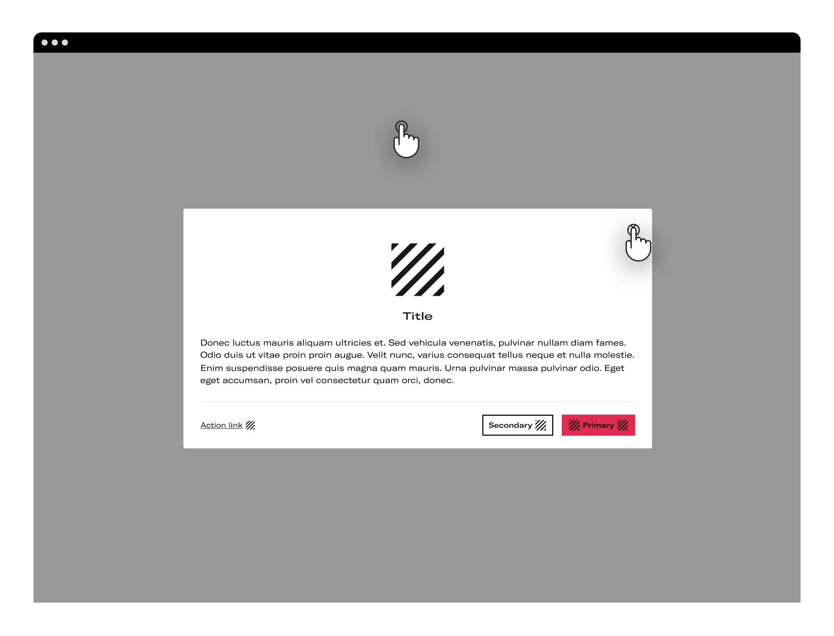
In desktop, user can close modal by clicking the close button or by clicking on the overlay.
In mobile, to close the modal the user can slide the modal down from the Close button or by taping on the overlay.
Layout
Desktop
- Position & Growing
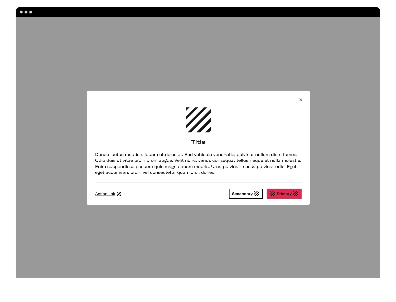
The dialogs appear from the bottom of the screen, positioning themselves above the other contents.
To express that the rest of the application is inaccessible the surfaces behind the dialog are masked with an overlay.
The height of the modal is defined by the content, it will grow according to the information displayed.
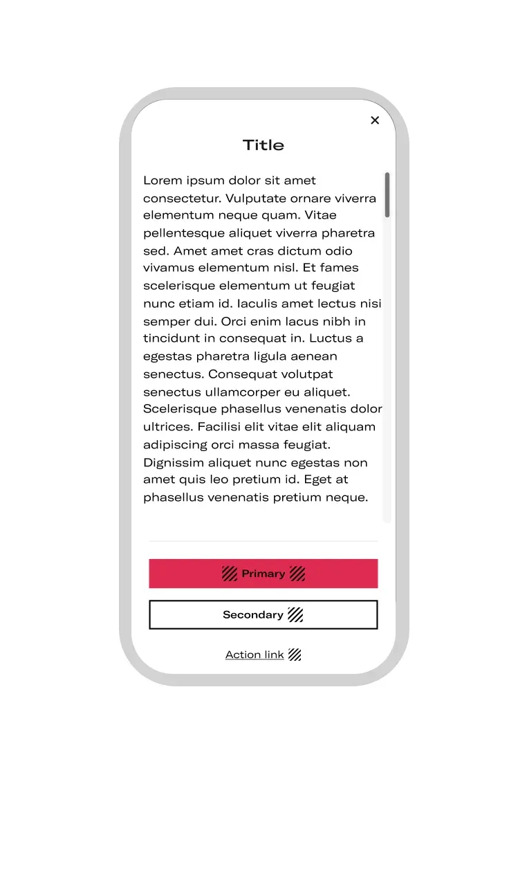
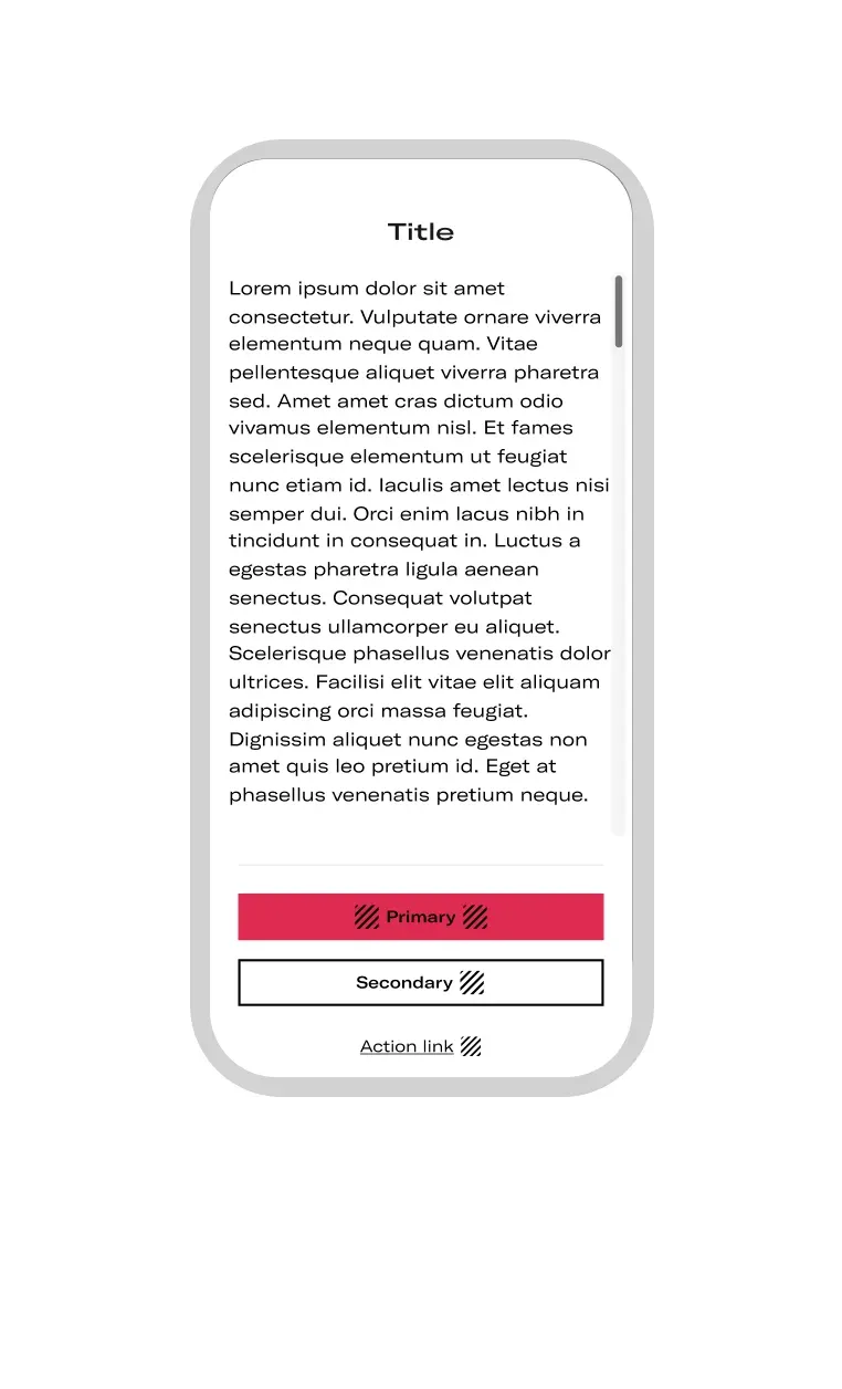
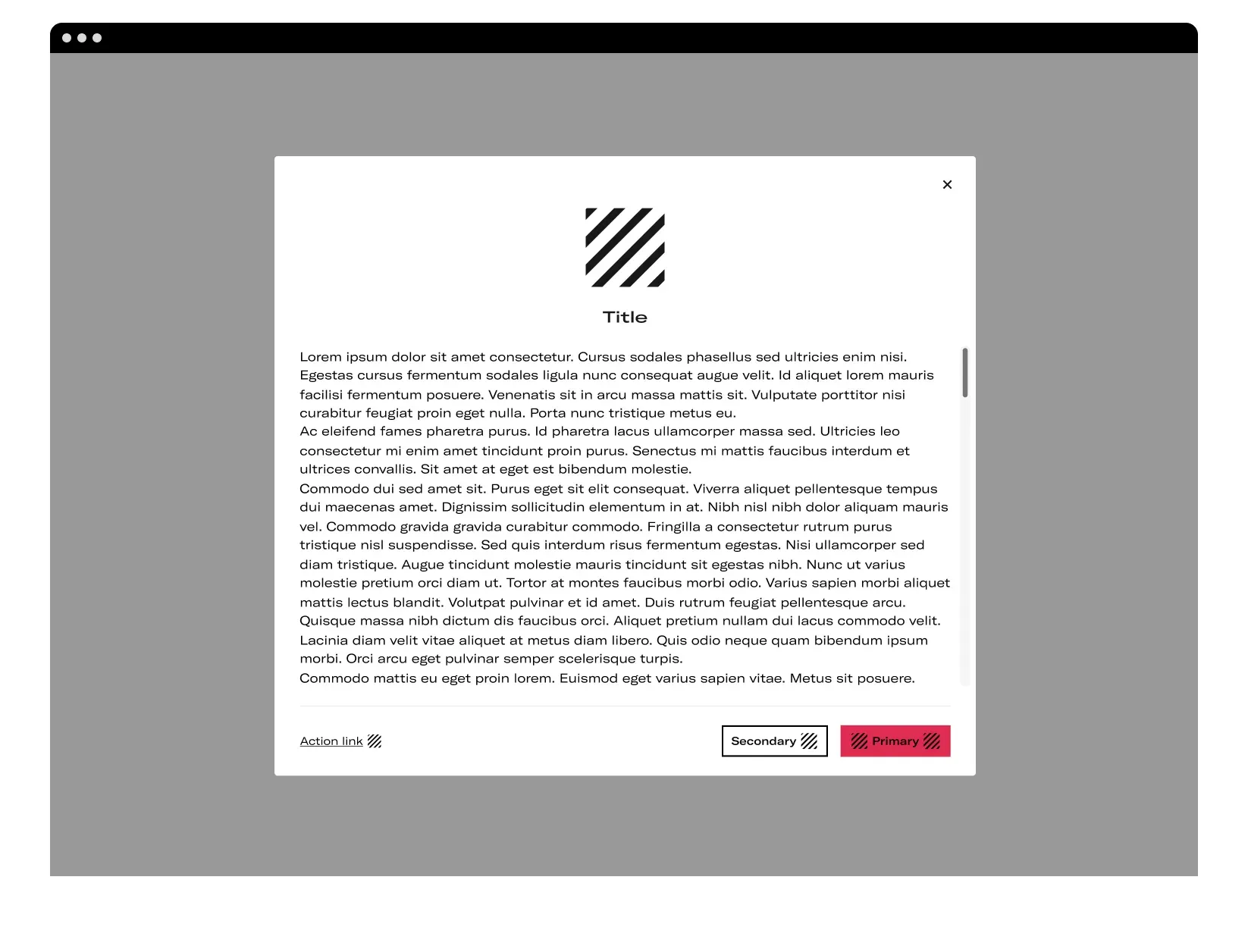
- Scrolling
If the content of the modal becomes too tall the modal will become FullScreen and if there is still text left over, a scroll will be displayed. When scrolling is required, the modal header is fixed at the top and the footer is fixed at the bottom. This ensures that the selected content remains visible next to the title and buttons, even when scrolling. When the scrolling content passes under the header and footer, they remain fixed.
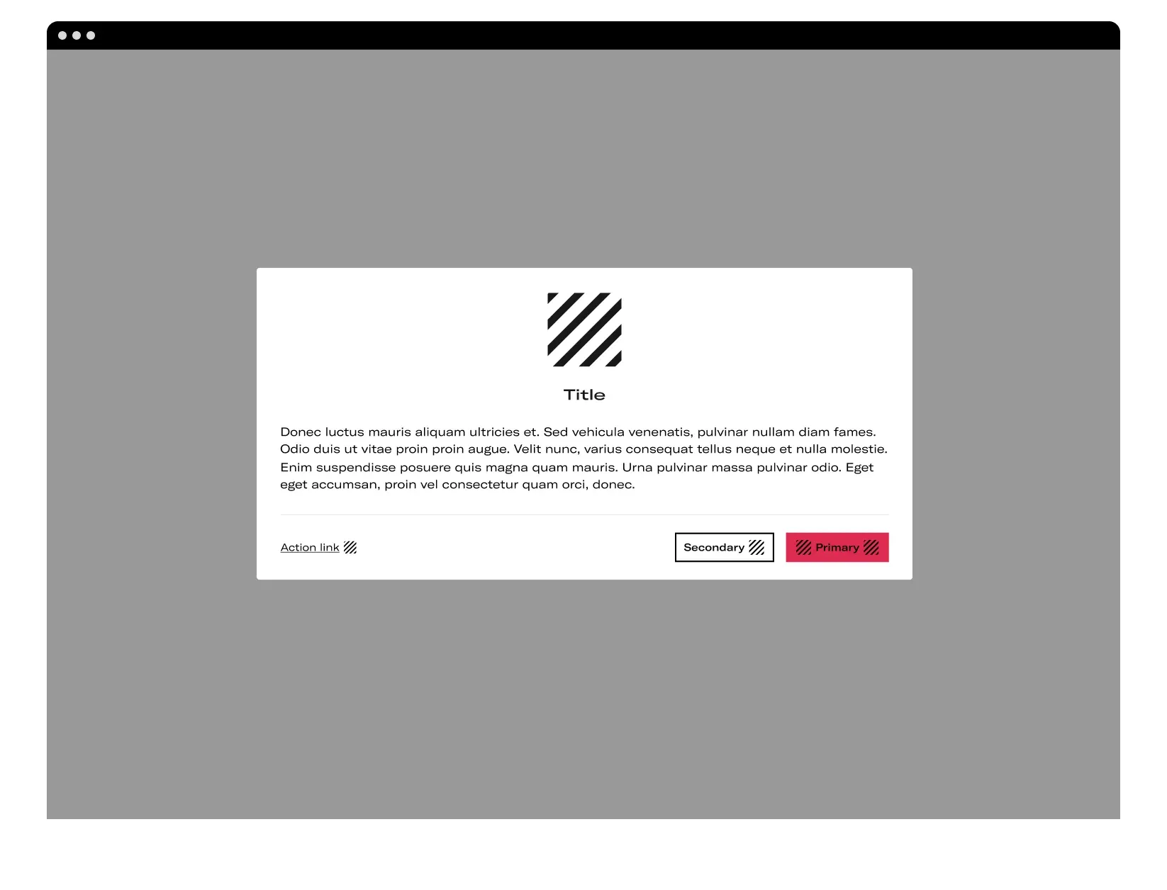
- Blocking modal
In cases where it is a locking modal, the close action will be disabled (the close button will not be displayed) and you will not be able to exit by clicking on the overlay.
When the modal does not have the close button, the user can only exit the modal using the footer.
-
The user cannot exit by clicking on the overlay. The function to close the modal by clicking outside must be disabled.
-
The user can only exit the modal using the footer.
Tablet & Mobile
- Position & Growing
The dialogs appear from the bottom of the screen, positioning themselves above the other contents.
To express that the rest of the application is inaccessible the surfaces behind the dialog are masked with an overlay.
The height of the modal is defined by the content, it will grow according to the information displayed.