
components
Snackbar
v.1.0.0 | Saturn Storybook
Short message that provide brief notification. The component is also known as toast.
Components
Play with the component with our playground.
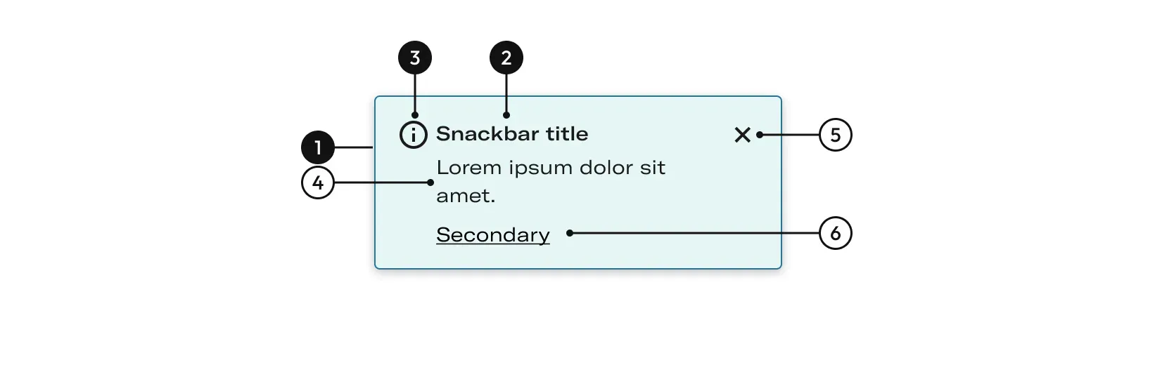
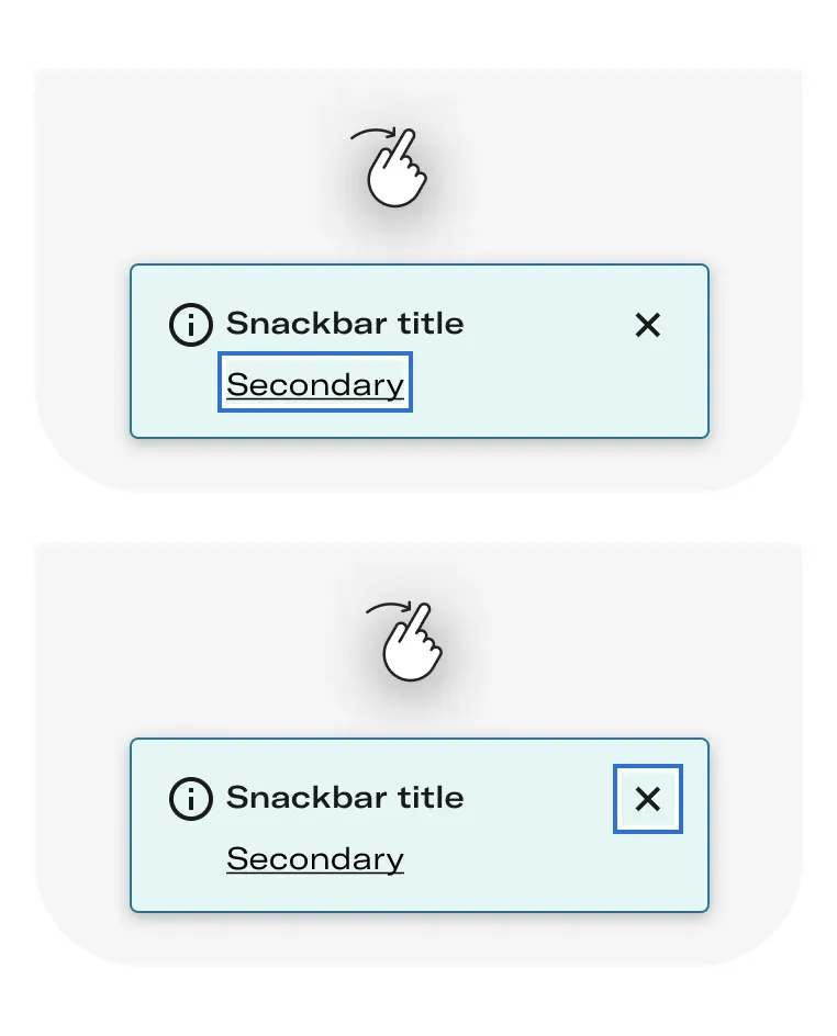
Anatomy
| Name | Description |
|---|---|
1 Required | width height |
2 Required | Icon helps identify the message type. |
3 Required | By accessibility the messages must always be accompanied by a title that defines the type of message: informative, warning, error... If we need to complement the title we would put it after the type of message. |
4 | Define the message. |
5 | It close the message. |
6 | It performs an action related to the message. |
States
Informative
Provides information related to an action.

Warning
Indicates an action that is relevant but not alarming to the user.

Success
Indicates that an action was successfully processed.

Error
Indicates an error in an action.

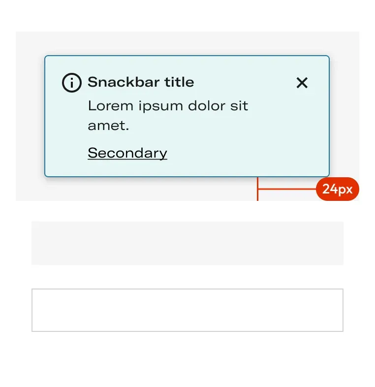
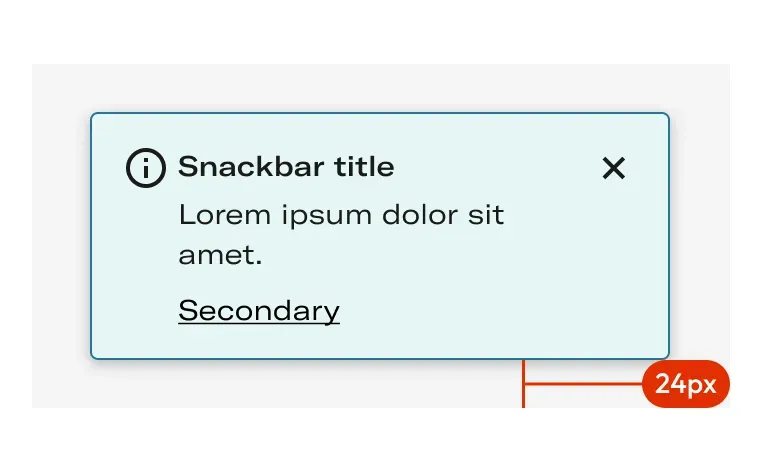
Layout
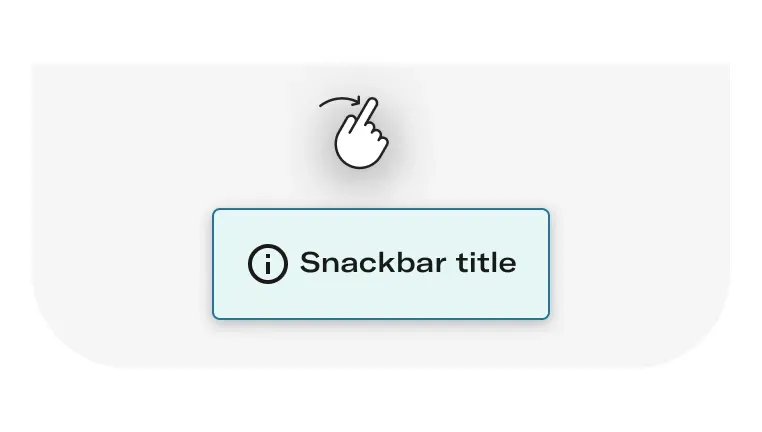
Behaviours
When to use
Simple
Used to notify users about the status of an action.
When to use: For simpler notifications, when it is not needed to make an action by the user.

Complex
Used to notify users about the status of an action when it is needed an action or when an error occurs in the proccess.
When to use: For simpler notifications, when it is needed to make an action by the user.

Do's and dont's

Use more than one snackbar at the same time stacking them one on the top of another. When multiple updates are neccessary, they should appear once at a time.

Link action need cannot be ignore or similar, as snackbar dissapears by default on their own if there is no interaction needed.

Snackbar should be brief and avoid long paragraphs of text (Max recommended 60 characters)