
components
Tooltip
v.1.0.0 | Saturn Storybook
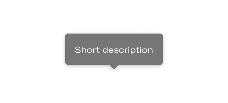
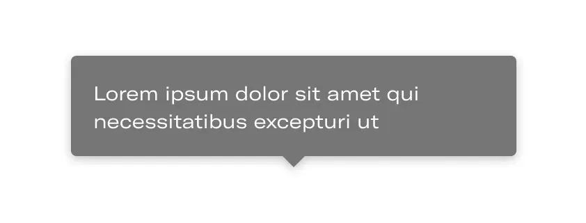
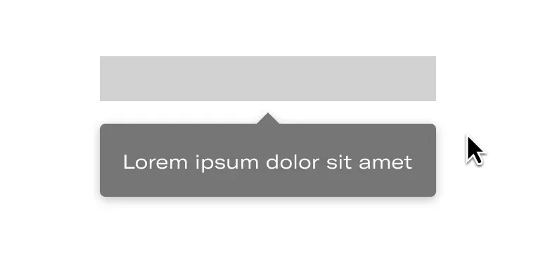
Simple text that displays extra contextual information next to the trigger element.
Components
Play with the component with our playground.
Anatomy
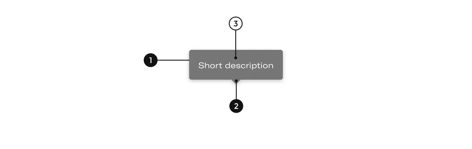
| Name | Description |
|---|---|
1 Required | width height |
2 Required | Point out the element to which it refers. |
3 | Define the element to be explained. |
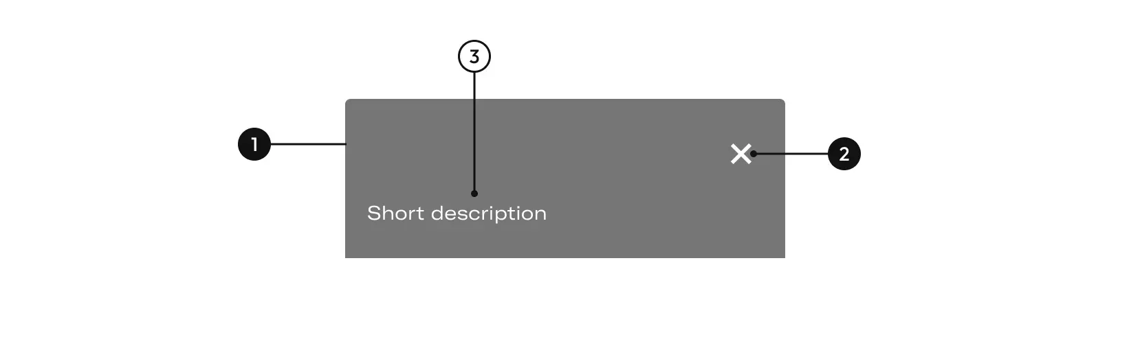
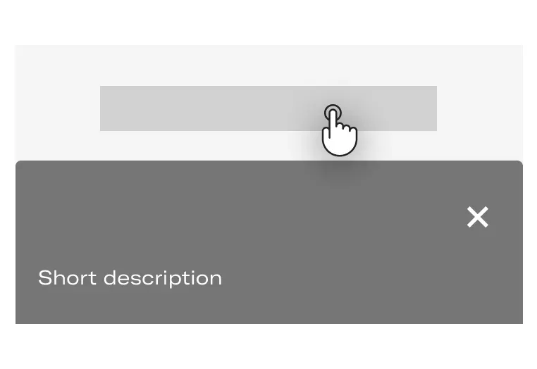
| Name | Description |
|---|---|
1 Required | width height left-radius right-radius |
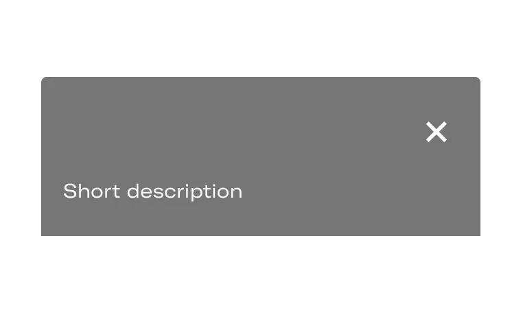
2 Required | It close the message. |
3 | Define the element to be explained. |
Options
Desktop
Basic - Only descriptionIt gives descriptive support to visual or action elements in just two words. These words don’t have a character limit.
Tablet and mobile
Basic - Only descriptionIt gives descriptive support to visual or action elements in just two words. These words don’t have a character limit.
Layout
Desktop
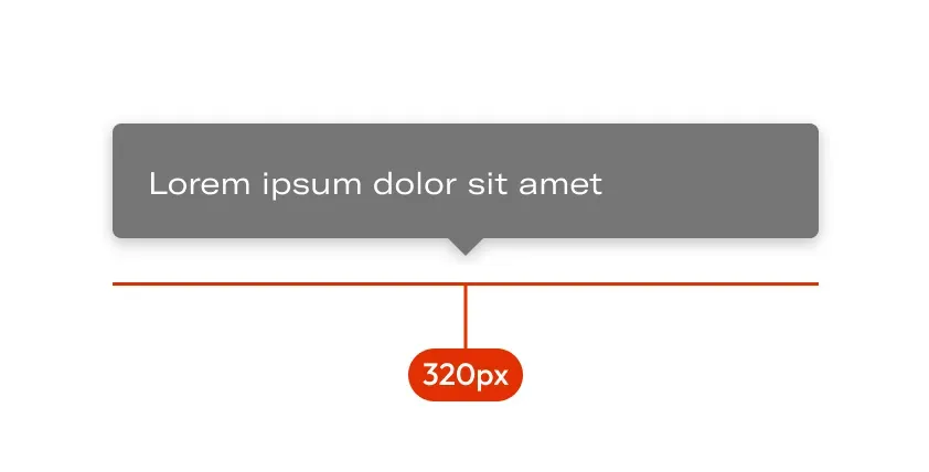
Fluid widthThe width of the tooltip will depend on the content up to a maximum of 320px.
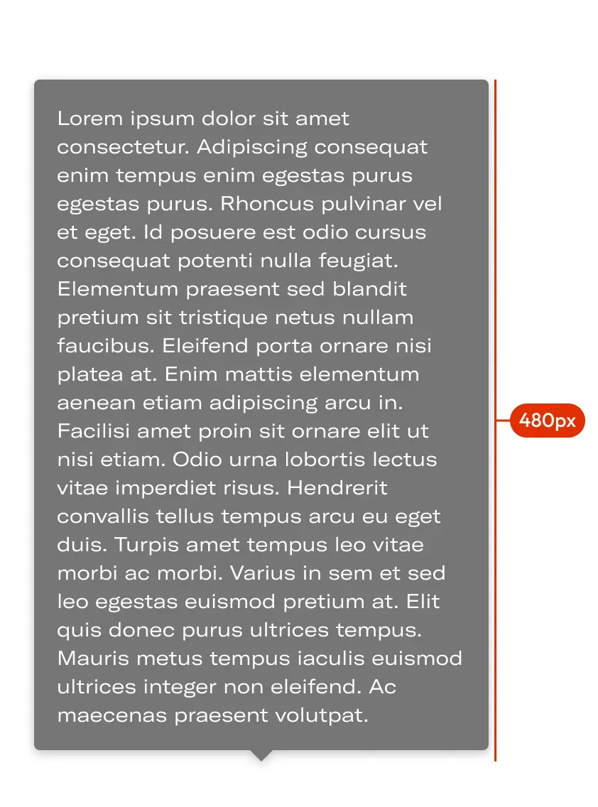
Fluid heightThe height will depend on the content up to a maximum of 480px.
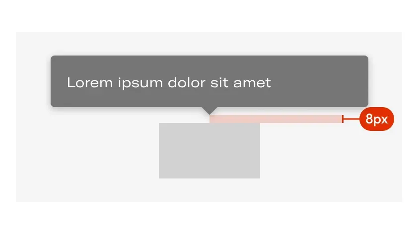
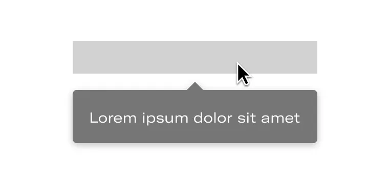
Margin between elementThe tooltip must always respect a margin of 8px with respect to the element that activates it.
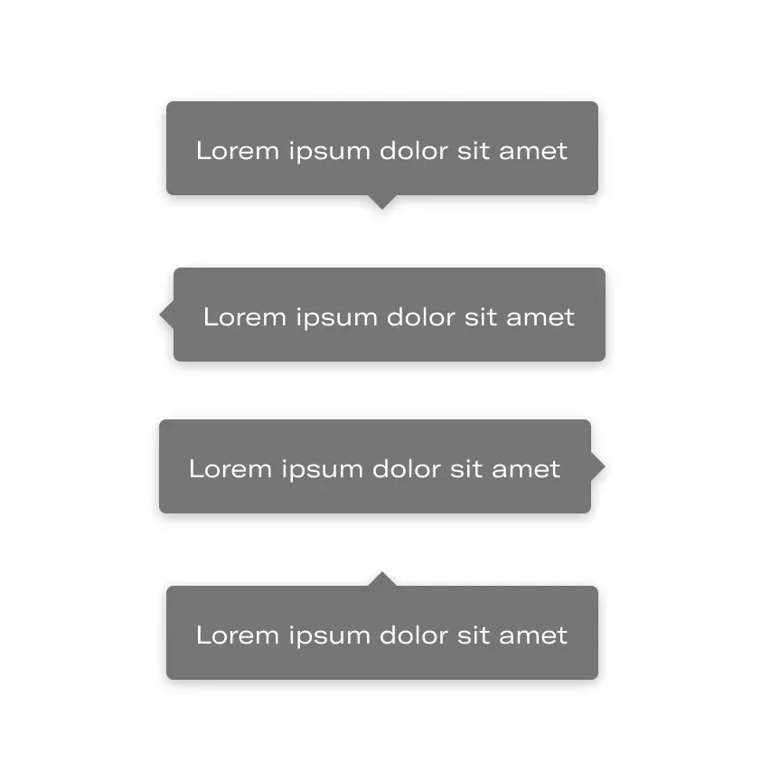
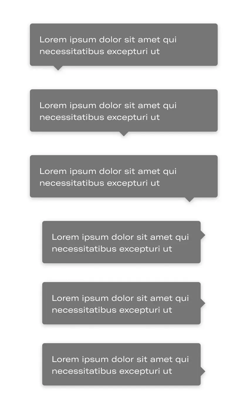
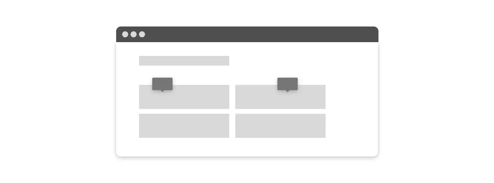
Trigger orientedThe arrow is situated in different positions depende on the trigger. The tooltip appears from there when the user interacts.
Several linesThe text and paragraph may contain several lines.
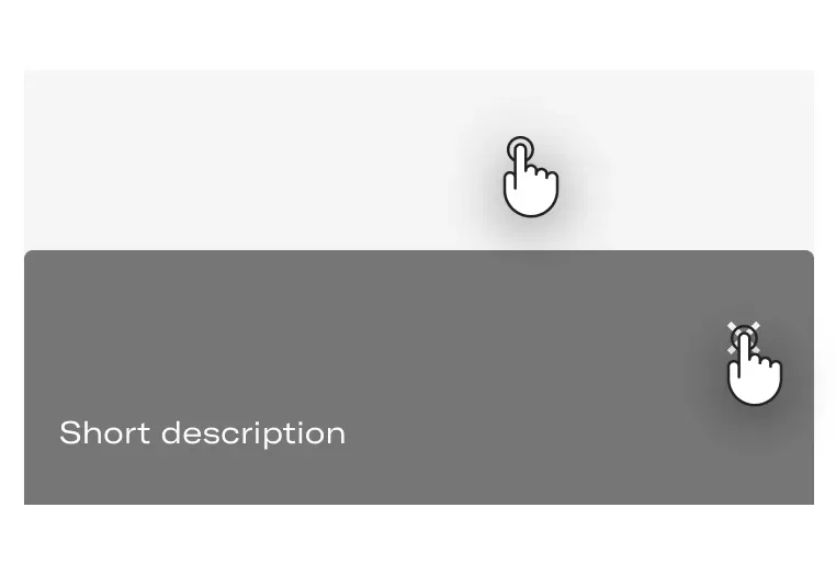
Position of the arrowThe arrow, it can be in the center, in one of the sides or in the other.
Tablet and Mobile
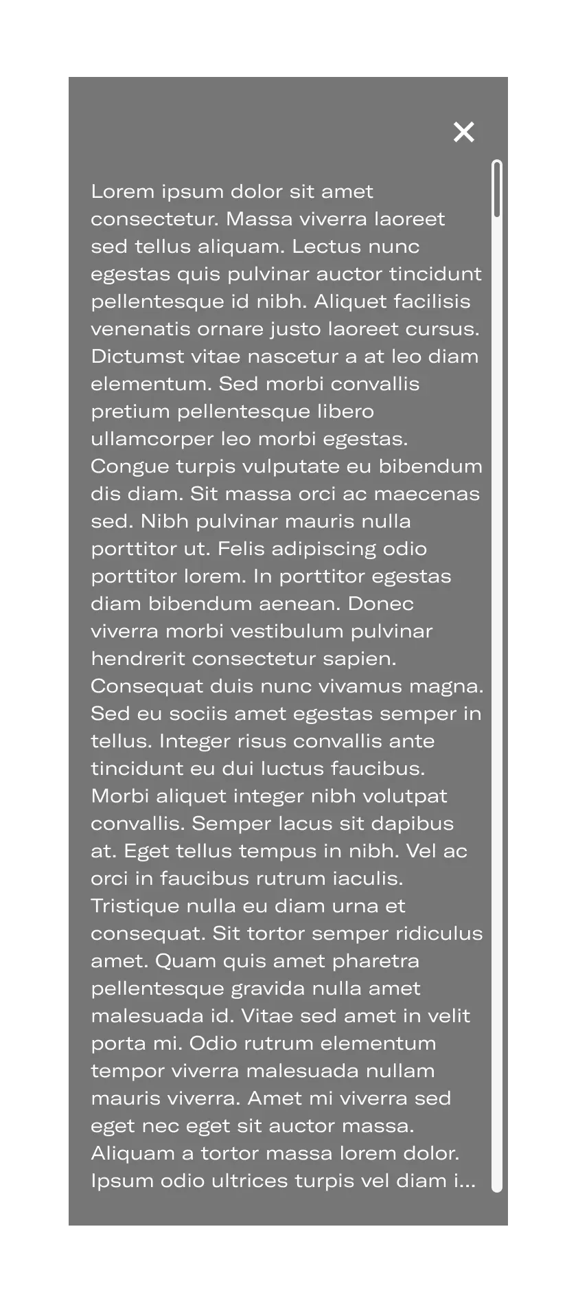
ScrollIf the tooltip has a lot of information and cannot be seen on the screen, a scroll bar will be shown. The paragraph must respect the bottom padding of 16px. The title and the close button are sticky.

Tooltip full widthThe tooltip (tablet and moble version) is full width. When the content is larger the tooltip will occupy the full height of the screen.
Behaviours

Element that activates tooltip
Desktop
Basic - Show tooltipThe tooltip can be displayed in the following ways:
- Keyboard focus: by keyboard focus on the activating element.
- Hover: Hovering over the activating element.
Basic - Hide tooltipIt can be hidden in the following ways:
- Losing Keyboard focus (escape key).
- Not hovering over the activating element.
Tablet and Mobile
Basic - Show tooltipThe tooltip can be displayed in the following ways:
- On tap: The user actively interacts with the element.
- Focus by default: In some cases it may appear open by default without being activated by the user.z
Basic - Hide tooltipIt can be hidden in the following ways:
- Tapping outside the tooltip area.
- Tapping on the close button.
Do's and dont's

Do’s
Display only text.

Don’t
Don’t display rich information and imagery on tooltips. Also don’t display buttons, links or other interactive elements.

Do’s
Use tooltips to explain an information or an action.
Don’t
Do not use several tooltips on the same screen.