
components
Checkbox
v.1.0.0 | Saturn Storybook
It allows user to select multiple values from several options. Always use label to briefly identify and describe the purpose of a checkbox element. For further context use helperText.
Components
Play with the component with our playground.
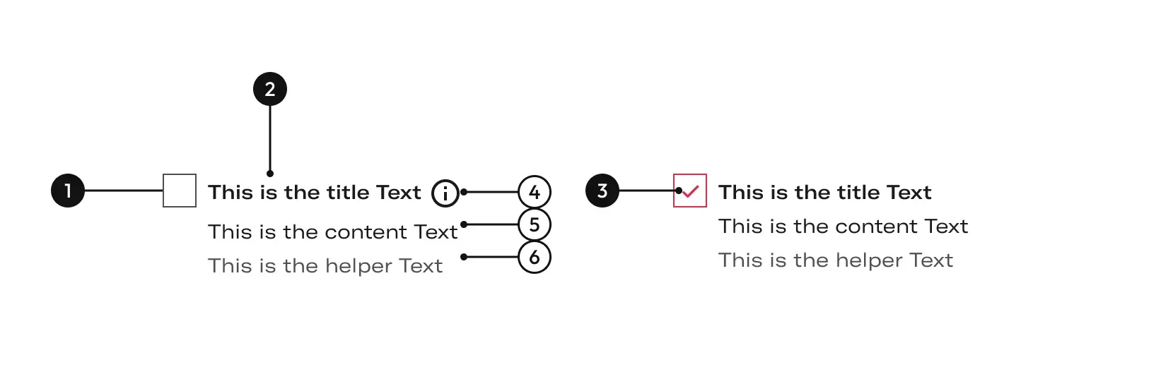
Anatomy
| Name | Description |
|---|---|
1 Required | width height |
2 Required | Describe the action that will occur if a user taps a checkbox. Will be the default label. We used bold title in special case. Example: when the options of a selection list need supporting description. |
3 Required | Indicates the checkbox state. |
4 | Opens a tooltip component. |
5 | Gives more information about the action described on the label. |
6 | Classic help text to give some more idea or condition about what is requested. It align to the left side. |
Variants
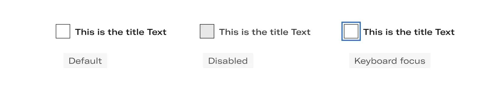
- Default unselected: A default state communicates an interactive component or element.
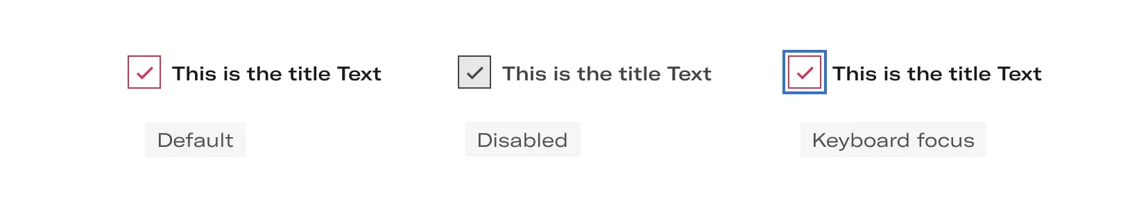
- Default selected: Displays the on state checkbox.
- Disabled unselected: A disabled state communicates a noninteractive component or element.
- Disabled selected: A disabled state communicates a noninteractive component or element.
- Keyboard focus: A keyboard focus state communicates when a user has highlighted an element, using an input method such as a keyboard or voice.
Unselected
Selected
Options
DefaultMay contain bold text.
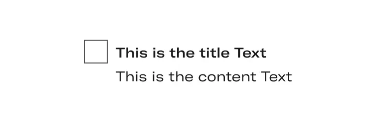
Title and contentMay contain title and text.
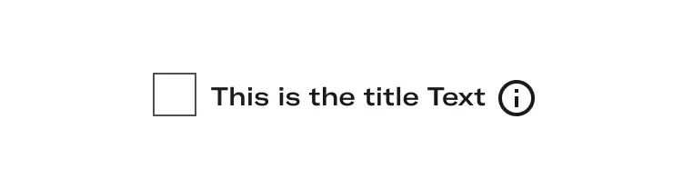
With tooltipMay contain bold text.
Layout
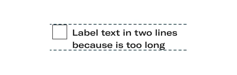
Several linesWhen the label has several lines, the text will be aligned at the top with the checkbox.
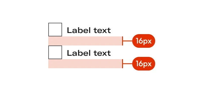
Vertical groupingBy following the arrow as the reading order, with this placement we will allow the user to read all the options.
Do's and dont's

Do’s
Checkboxes let users select one or more options from a list.

Don’t
Selection elements cannot be combined.