
components
Navigation Card
v.1.0.0 | Saturn Storybook
Components
Play with the component with our playground.
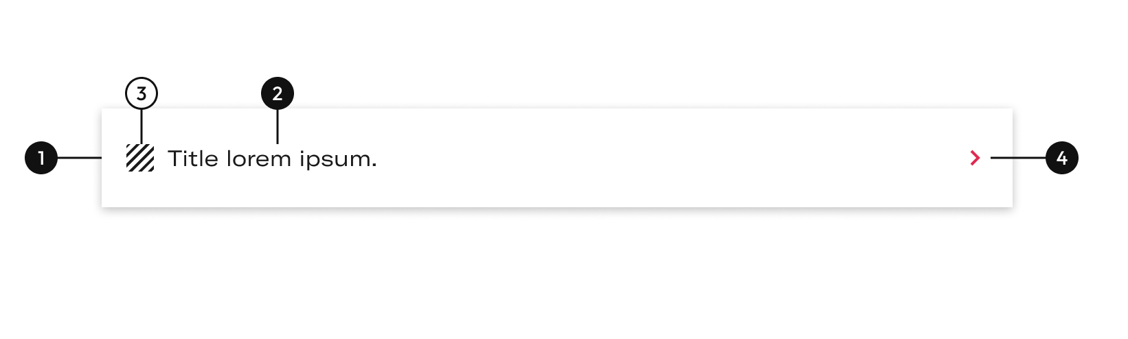
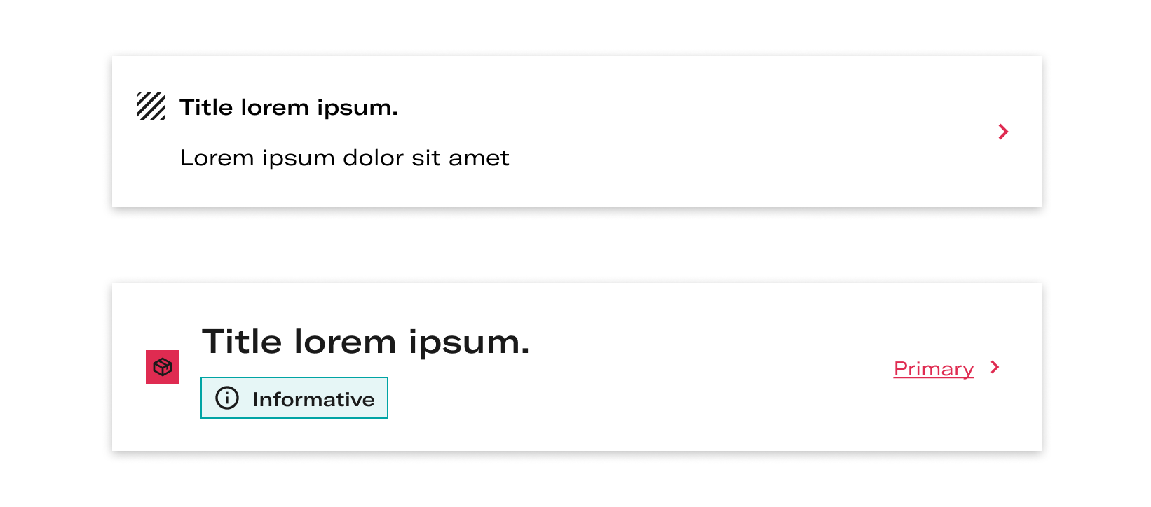
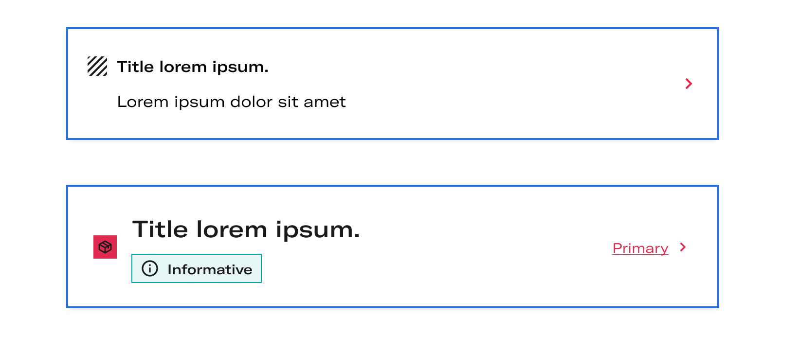
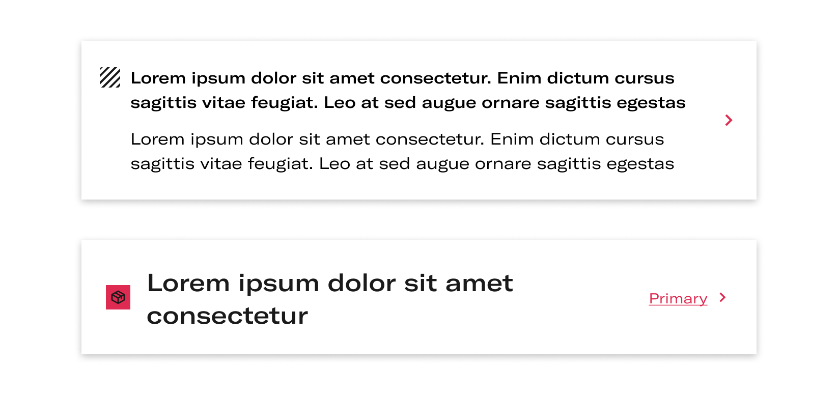
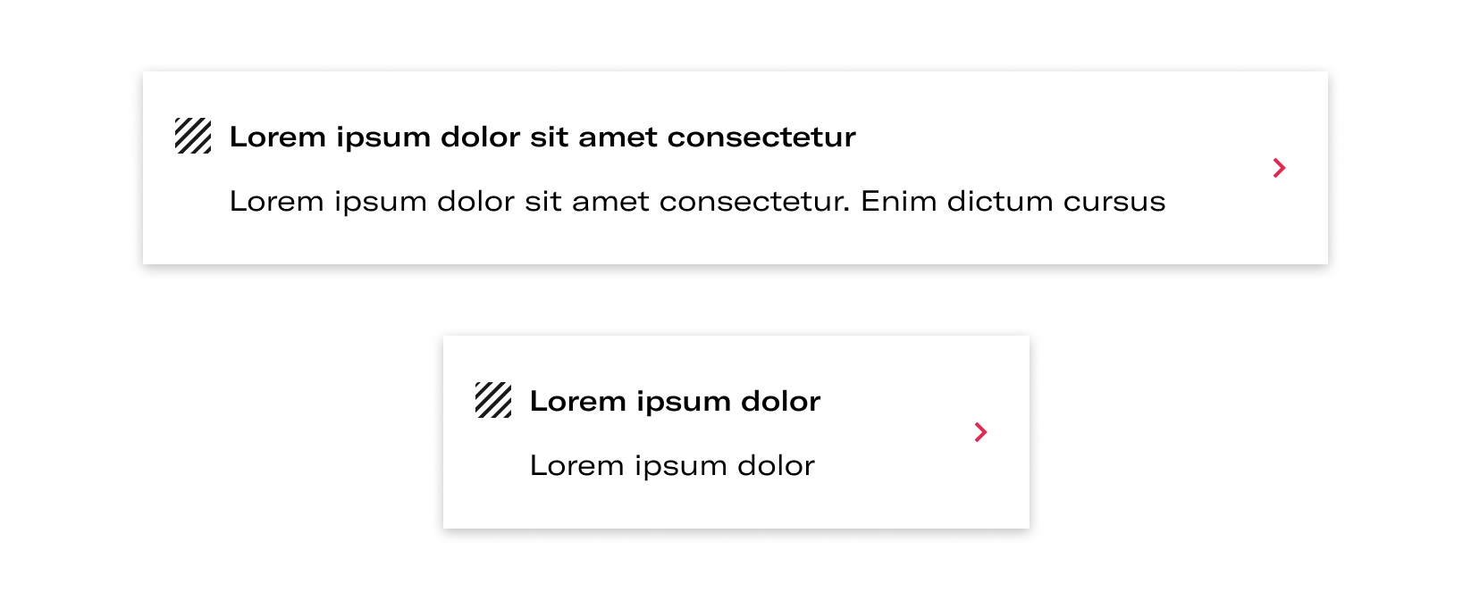
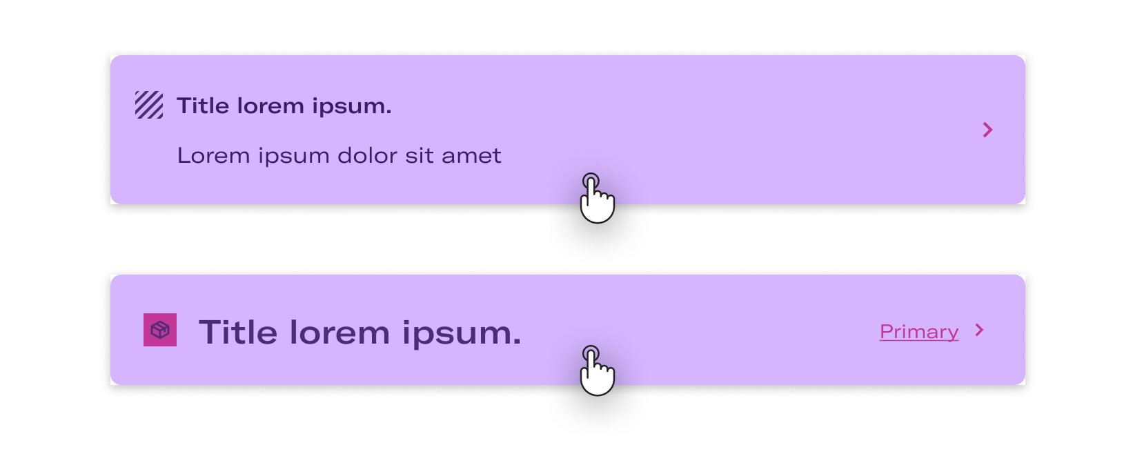
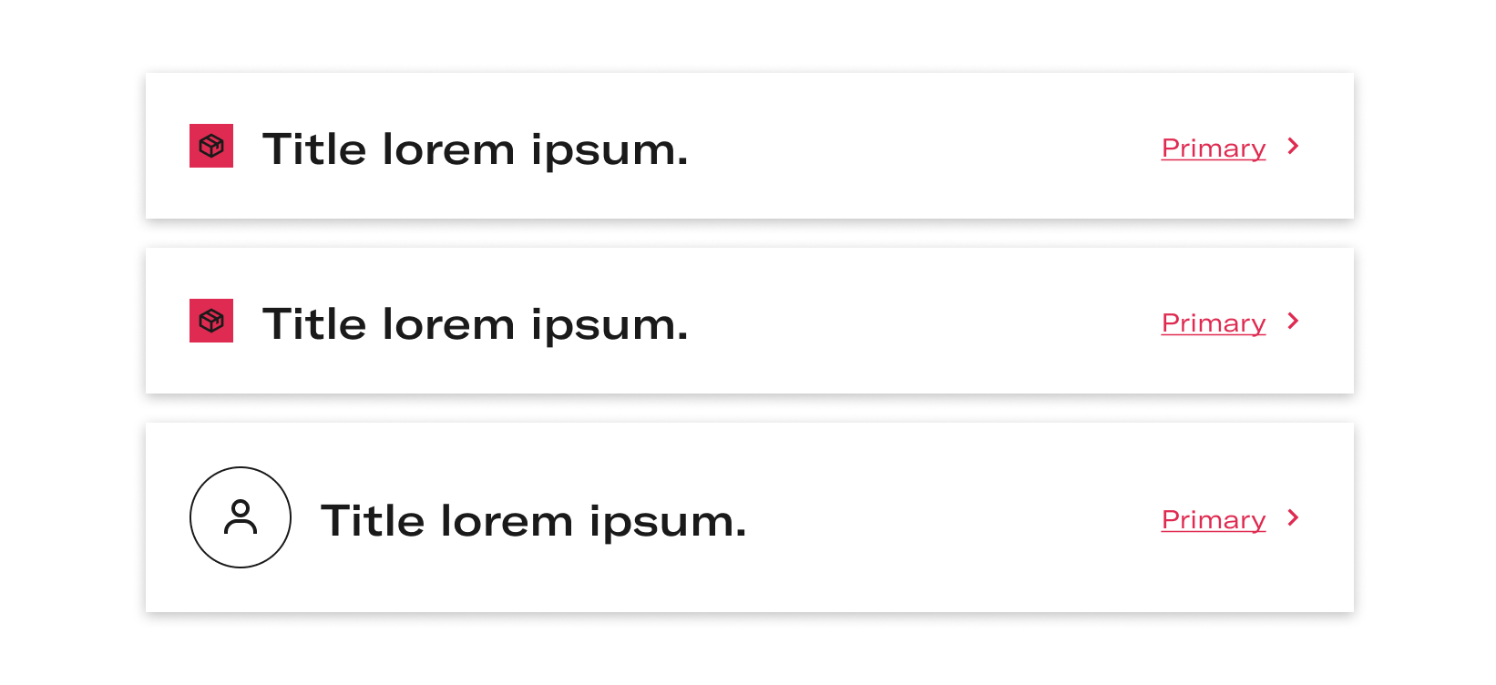
Anatomy
Primary
| Name | Description |
|---|---|
1 Required | width height |
2 Required | Short explain the action. The title may be underlined if its needed as an option. |
3 | Is a decorative icon that accompanies the meaning of the text. |
4 | Detailed explain the action. It can’t be underline |
5 Required | This arrow indicates there is a navigation. |
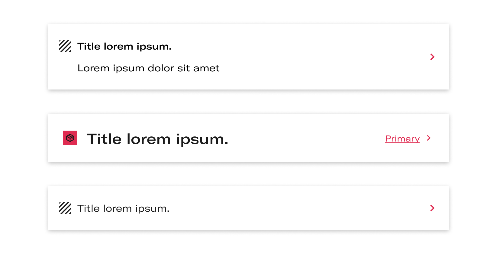
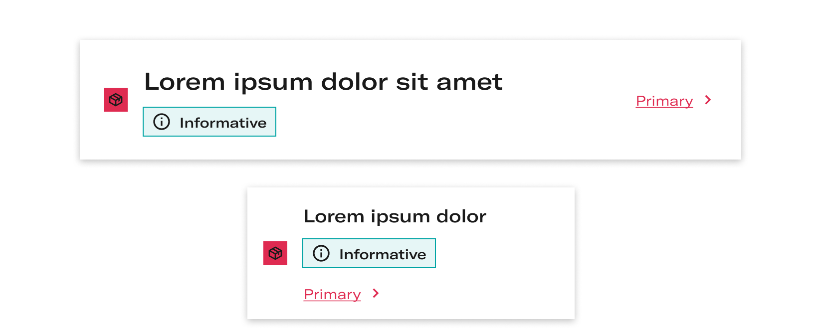
Primary large
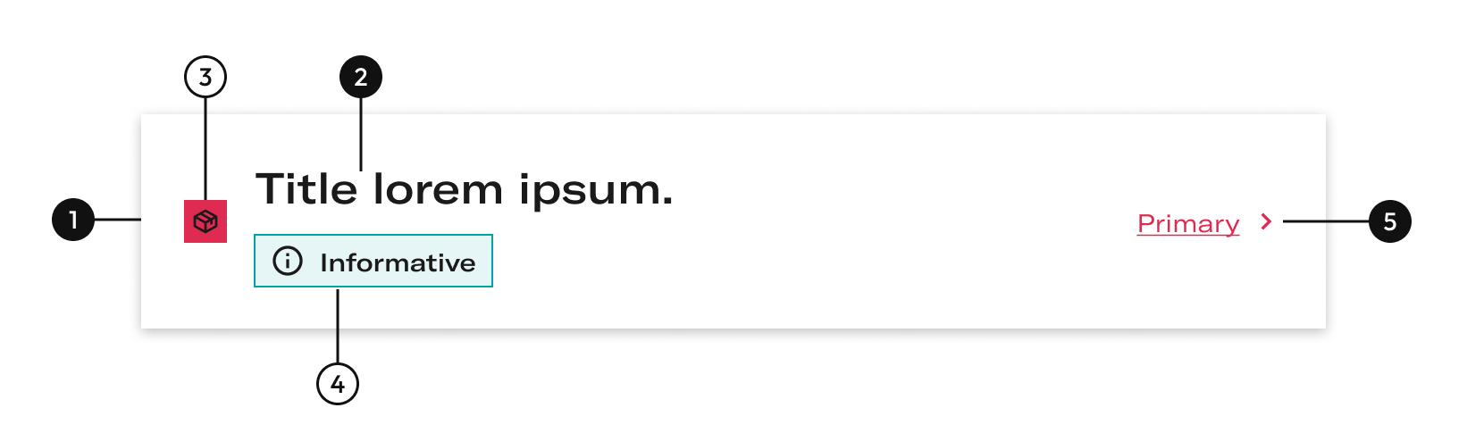
| Name | Description |
|---|---|
1 Required | width height |
2 Required | Short explain the action. The title may be underlined if its needed as an option. |
3 | Is a decorative icon that accompanies the meaning of the text. |
4 | Indicates the state of the card. |
5 Required | This link indicates there is a navigation. |
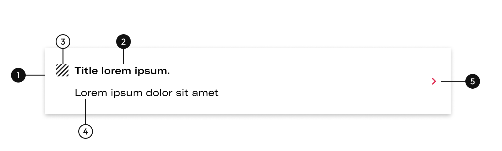
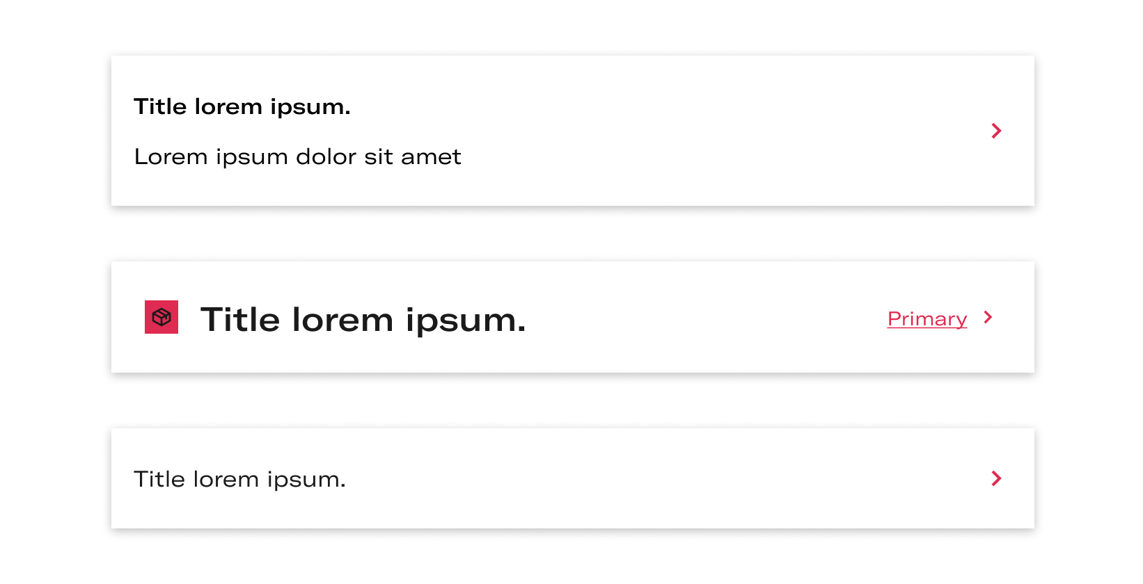
Primary basic
| Name | Description |
|---|---|
1 Required | width height |
2 Required | Short explain the action. The title may be underlined if its needed as an option. |
3 | Is a decorative icon that accompanies the meaning of the text. |
5 Required | This arrow indicates there is a navigation. |
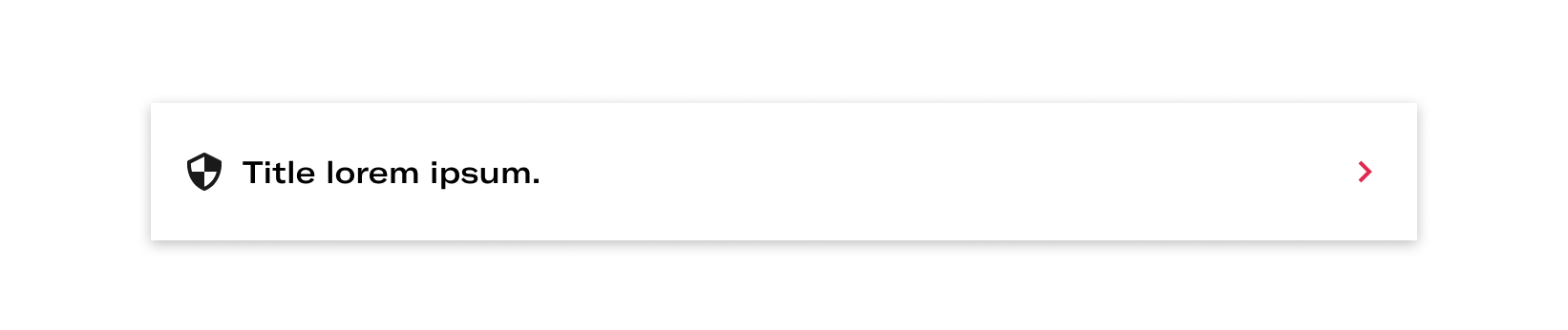
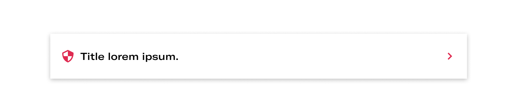
States
- Default
- Keyboard focus
The interaction area is the entire card so the keyboard focus covers the entire card, the link does not carry keyboard focus, as it only supports the action that the card leads to another screen.
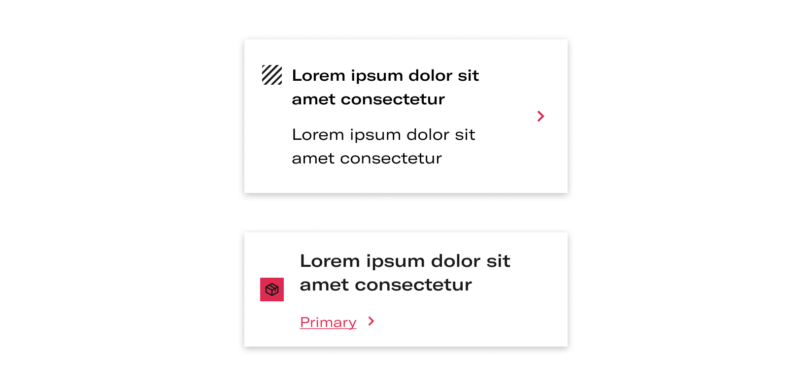
Options
- With decoration
- Without decoration
Remove the icon if there is no need or need more space for the content
- Types of decoration in Primary large
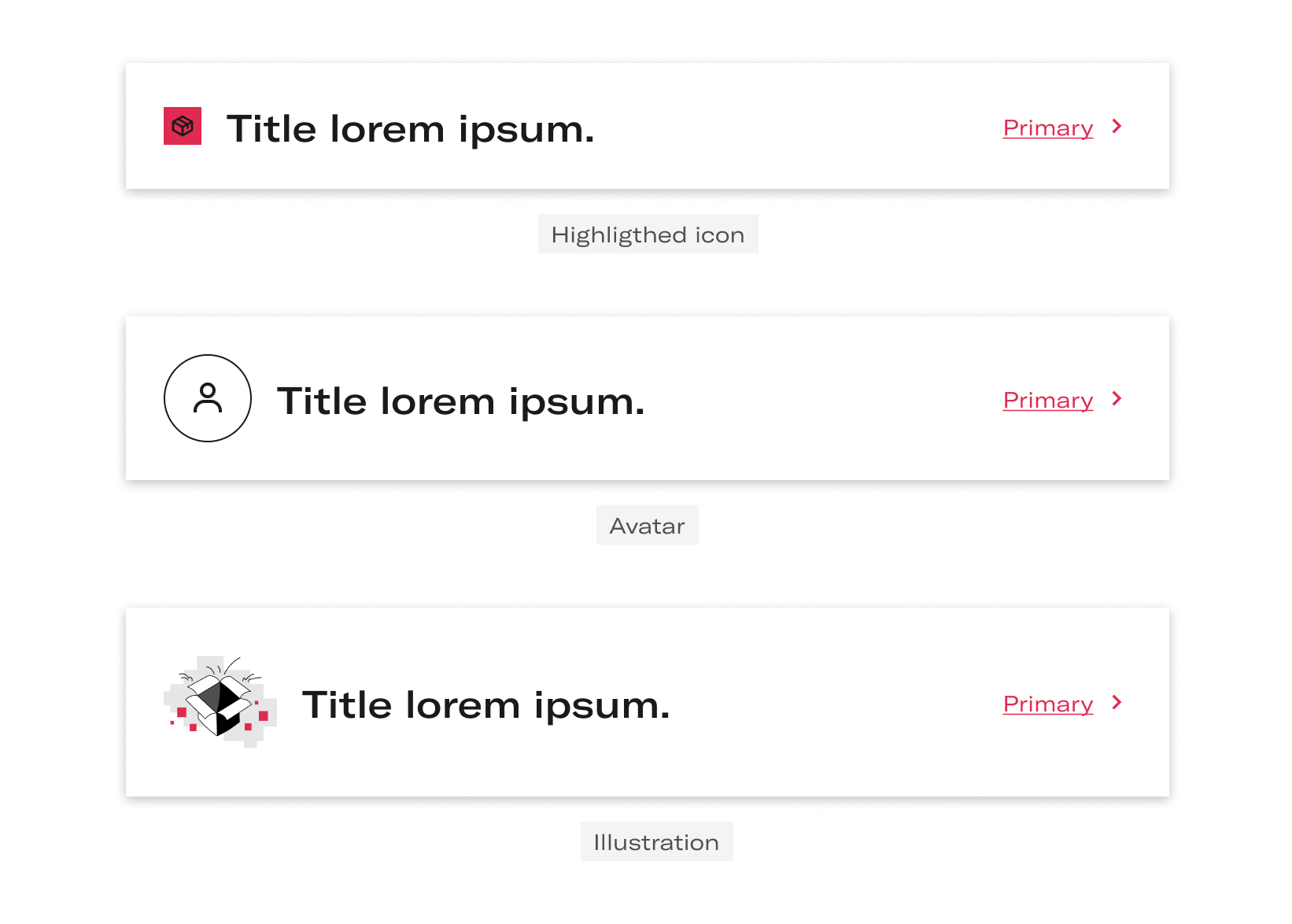
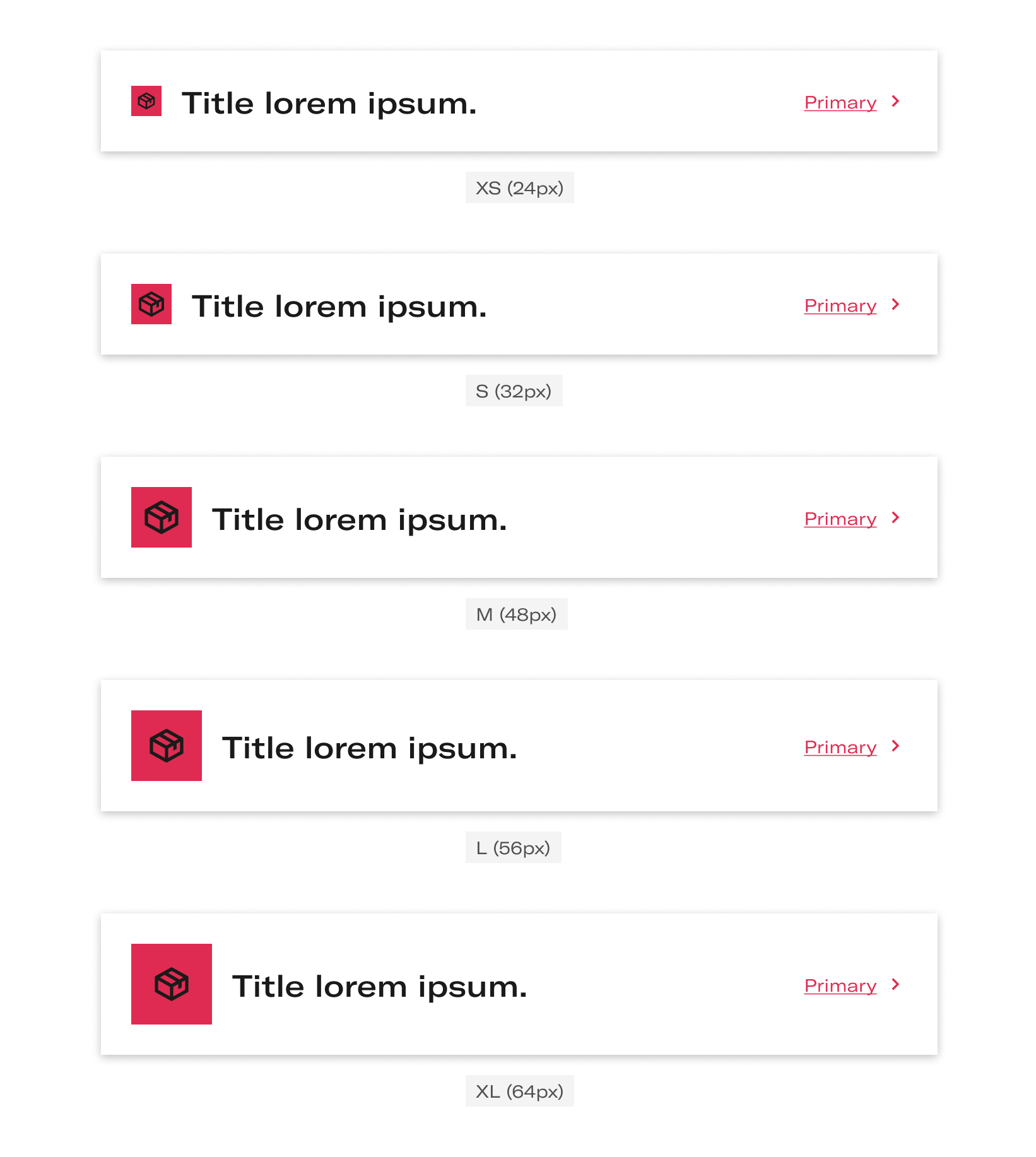
Sizes
- Highligted icon
- Avatar
Behaviour
Several lines
The content can grow several lines vertically.
- Desktop
- Tablet and mobile
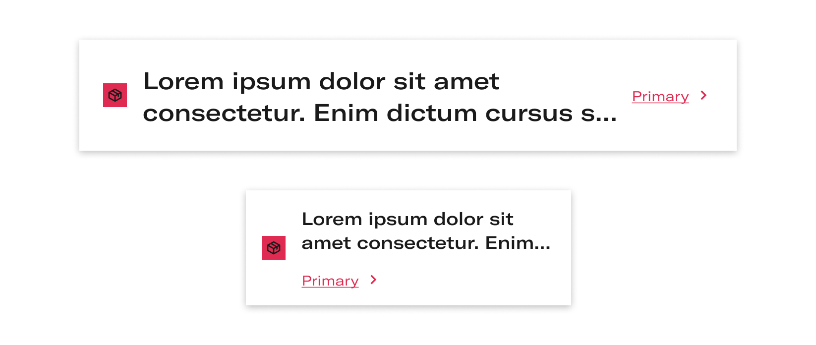
Title with more than 2 lines
Title with more than two lines with ellipsis. Only Primary-Large variant. It is not possible to display the content in more than two lines. If the text has more than TWO lines, an ellipsis will appear.
Vertical align Primary
Vertical align in top respect to decorations in Primary variant.
Vertical align Primary-Large
Vertical align in middle only for Primary-Large variant.
Layout
Desktop and tablet
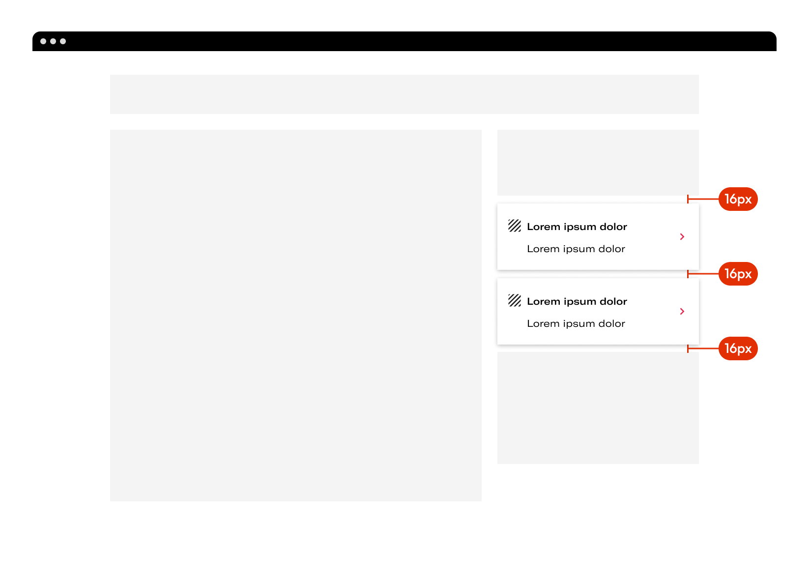
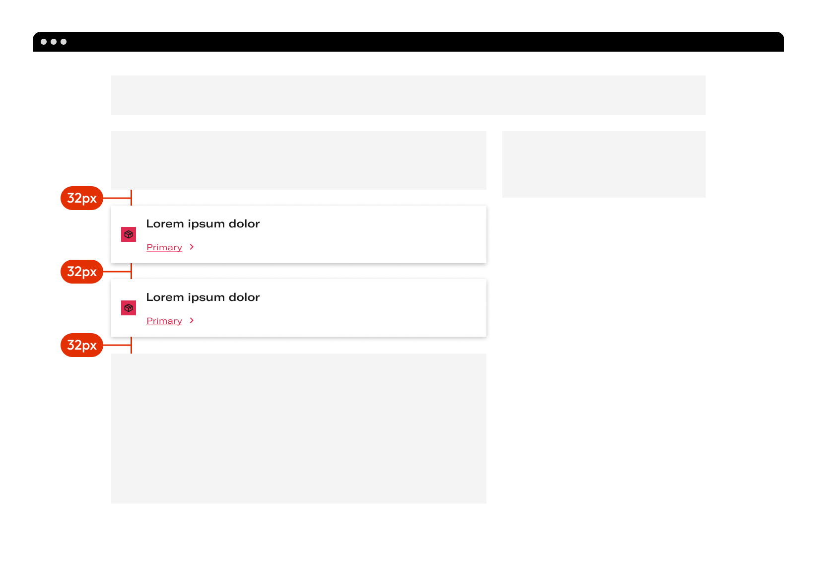
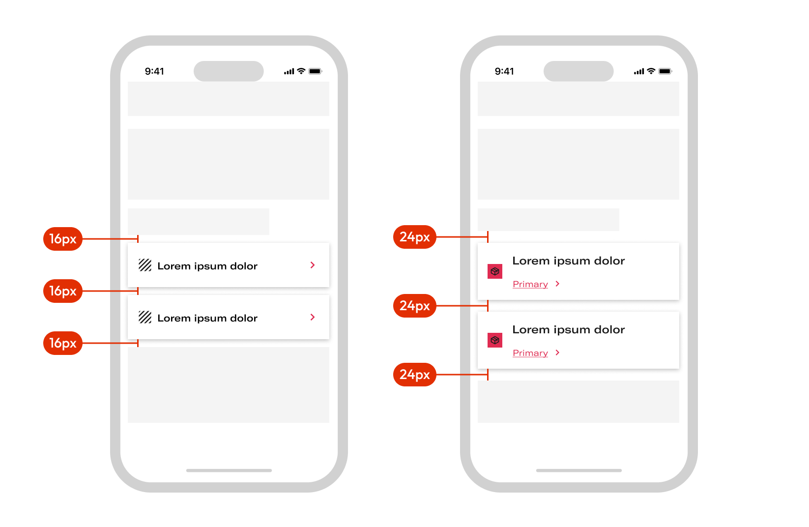
The NavigationCard is located within the sidebar. Any element above the NavigationCard must be at 16px appart.
Mobile
Clickable area
When the user clicks on the row, it navigates to another view where the user can see the content.
Do's and dont's
Use the decorative icon with the color established.
Do not change the established color of the icons.
Do not use differents decoration type in the same list