
components
List Option
v.1.0.0 | Saturn Storybook
Component
Play with the component with our playground.
Anatomy
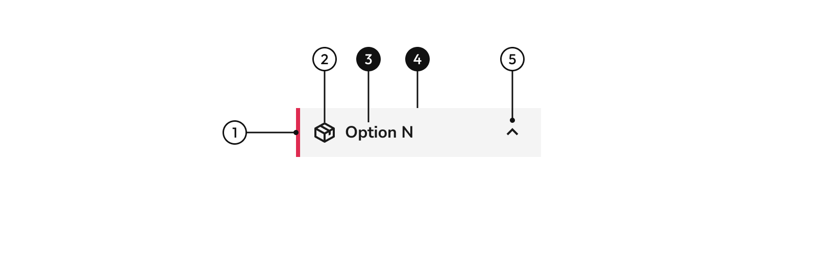
| Name | Description |
|---|---|
1 | width height |
2 | Indicates that there is a multiple selection. |
3 Required | Describes the option. |
4 Required | width height |
5 | Icon can be shown to give user more information. |
Status
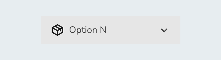
UnselectedDisplays the default option without user interaction.
HoverDisplays the status when the cursor is placed over the element to indicate that it is clickable.
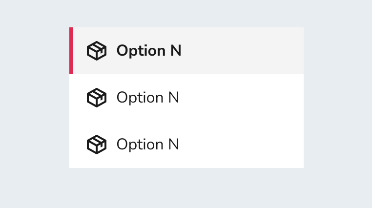
SelectedDisplays the option selected by the user.
DisabledIndicates to the user that the option cannot be selected.
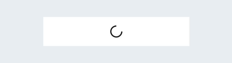
LoaderThis state communicates a noninteractive component. An animated loader is displayed in order to inform the user that more information is being processed.
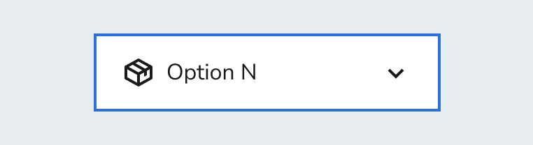
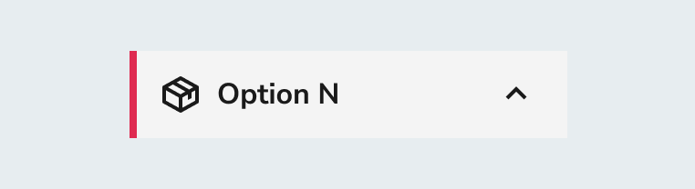
Keyboard focusThe entire container is clickable.
Behaviour
Simple selectionIn simple selection only one option can be selected from the list.
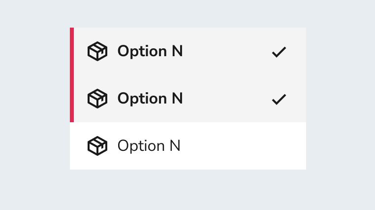
Multiple selectionWhen the list allows multiple options to be selected, a check will be included in the option.
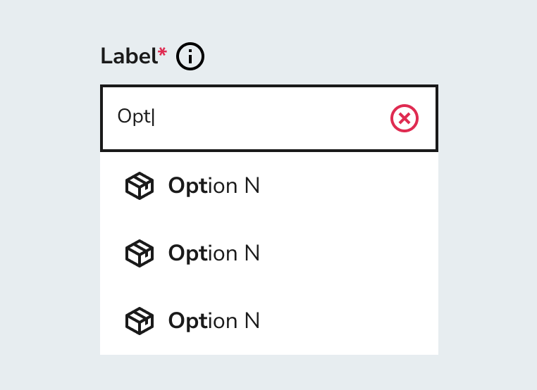
Filling stateWhen the ListOptions is using in the InputSearch, only the words that the user types are bolded.
Options
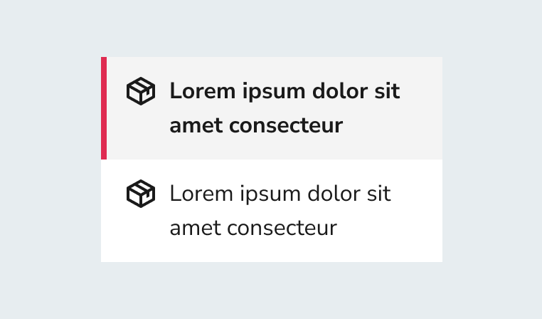
Several linesThe container can have several lines of text. The left icon is aligned to the top with the text and the check icon is aligned to the center with respect to the text.
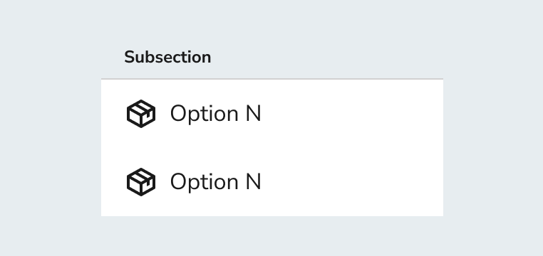
SpacingWhen the options are accompanied by a section title, they must have a spacing of 8px and a line separator.
Layout
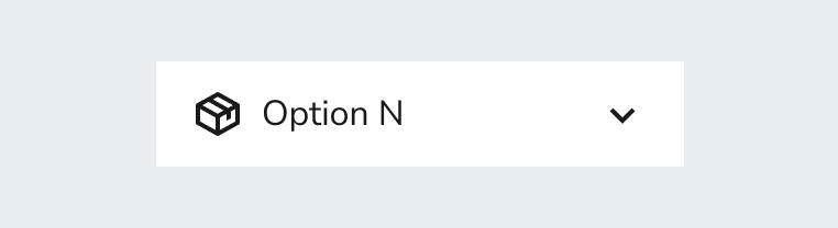
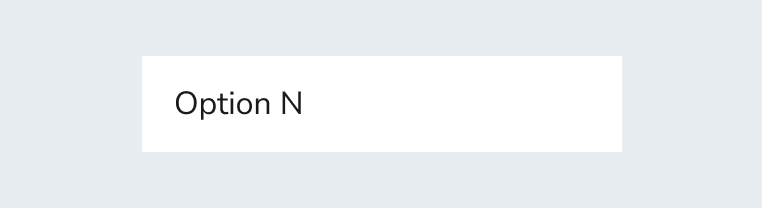
Without iconBy default the option will be displayed without icon.
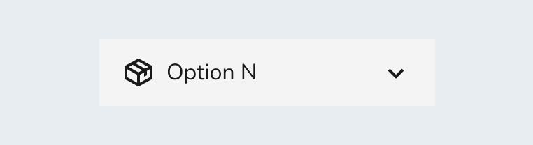
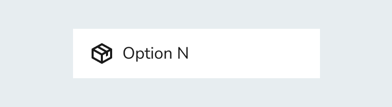
With iconMay contain a decorative icon.