
components
Line Separator
v.1.0.0 | Saturn Storybook
Component
Play with the component with our playground.
Anatomy
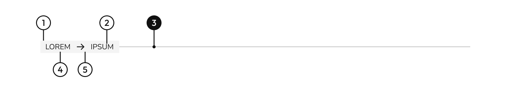
| Name | Description |
|---|---|
1 | width height |
2 | Section name: It can be text, numeric, date or range information. |
3 Required | width height |
4 | Section name: It can be text, numeric, date or range information. |
5 | When it is needed to show a range of information. |
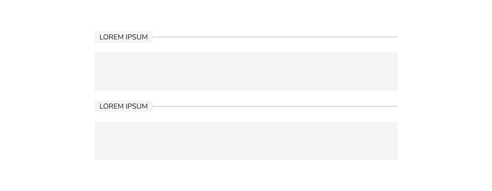
Variants
- Decorative

- Informative

- Range

Behaviours
- Fluid width
The width will be fluid and will depend on the parent element.
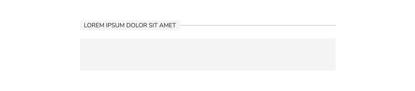
- Label width
The width of the label will be fluid and will depend on the parent element.
Do's and dont's

Do’s
Use the line separator with the default colors.

Don’t
When the line separator is consider informative, the color of the line must pass accessibility over the color of the background.

Do’s
Use the line separator with the default colors.

Don’t
The use of lowercase typography at 12px size is not recommended for accessibility.
Do’s
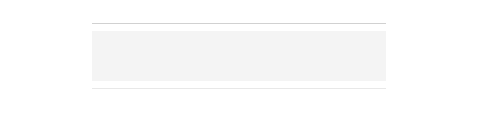
Informative line separator can be used without label to separate elements or group of elements such as table rows.