
components
Table
v.1.0.0 | Saturn Storybook
Play with the component with our playground.
Anatomy
Desktop and tablet
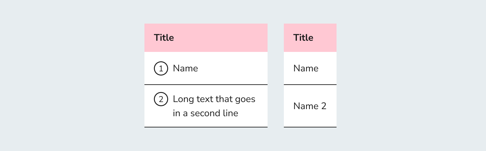
| Name | Description |
|---|---|
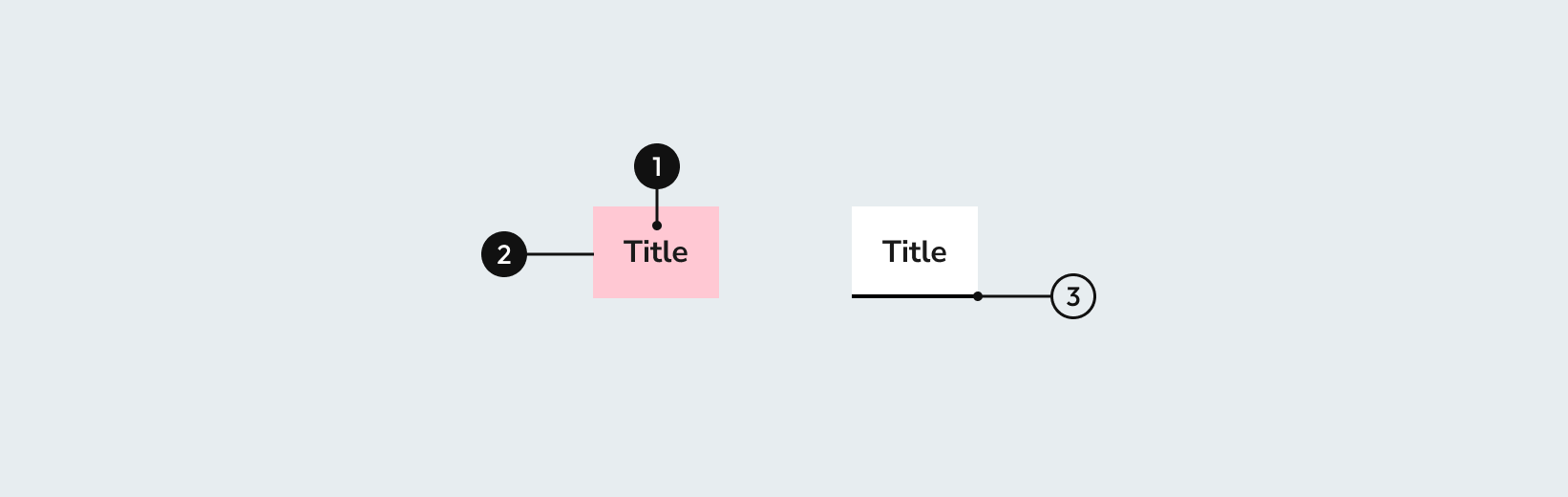
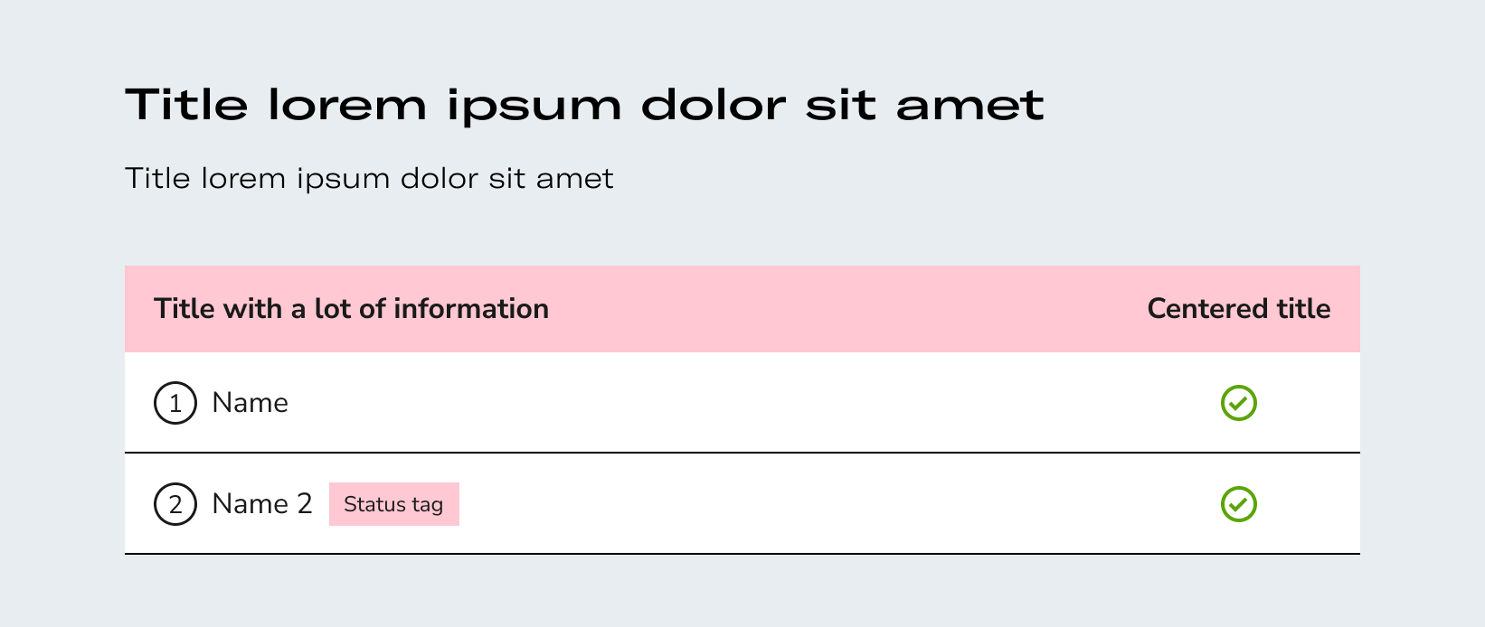
1 Required | Indicates the type of data shown in the column. |
2 Required | width height |
3 | It can highlight header row. |
| Name | Description |
|---|---|
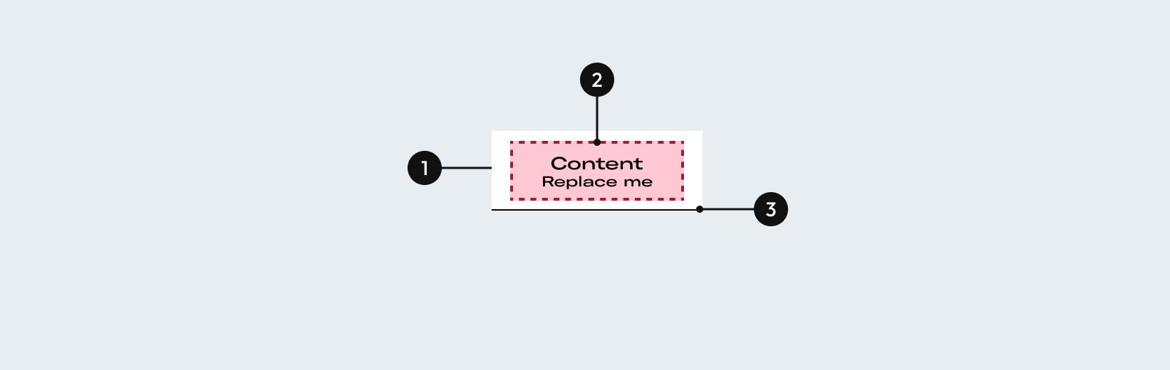
1 Required | width height |
2 Required | Indicates the type of data. |
3 Required | It helps to separate rows. |
Mobile
| Name | Description |
|---|---|
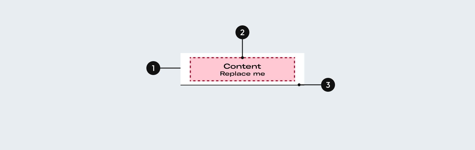
1 Required | width height |
2 Required | Indicates the type of data. |
3 Required | It helps to separate rows. |
Options
Layout
- Long texts and minimum padding
It will go in two lines if needed and the whole row will increase height keeping the paddings of 24px.
Desktop
- Columns width
Rows will be fluid and it will be 100%, bounded by the longest element of the column.
When integrated with other elements, table will have fluid width and it will 100% of the others elements width.
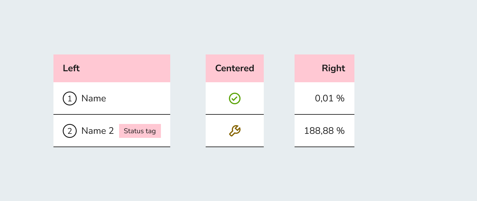
- Alignment
Elements alignment can vary depending on each content of the column row.
- Vertical paddings
The cells will have a margin above and below the content of 16px.
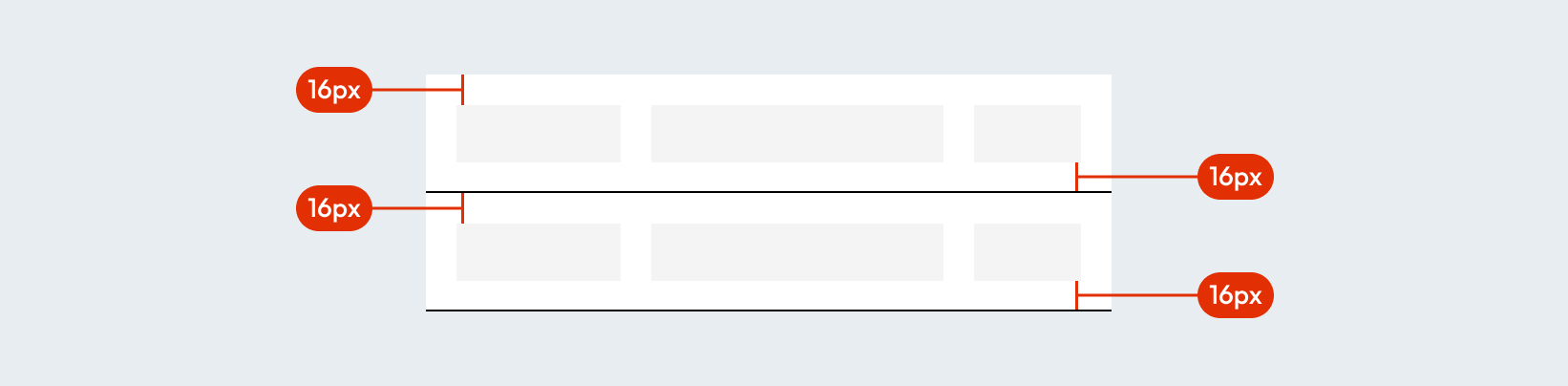
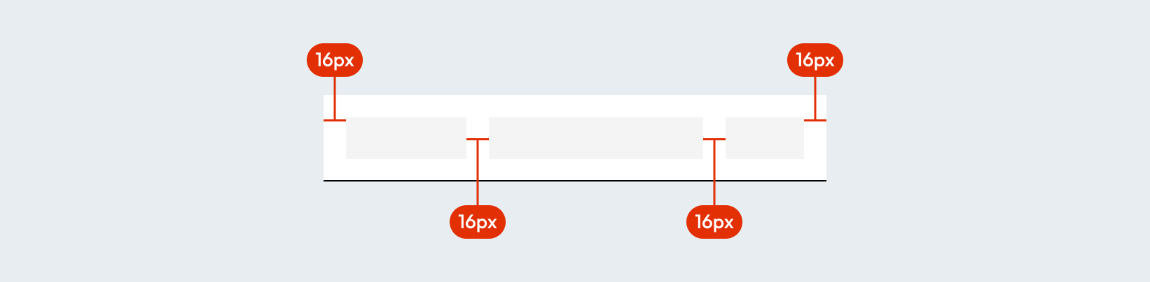
- Horizontal paddings
Content will have a margin of 16px on the left and on the right. Minimun space of 16px between columns. They have to respect is a minimum size of 16px to avoid breaking the table.
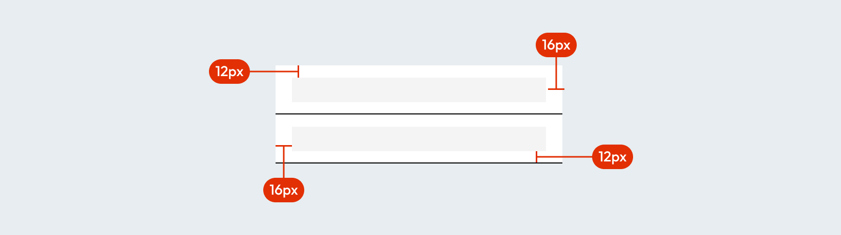
Tablet and mobile
- Margin
The Cells will have a margin above and below the content of 12px. Content will have a margin of 16px on the left and on the right.
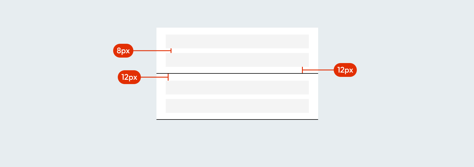
- Paddings between elements
Minimun space of 8px between section elements.
Do's and dont's
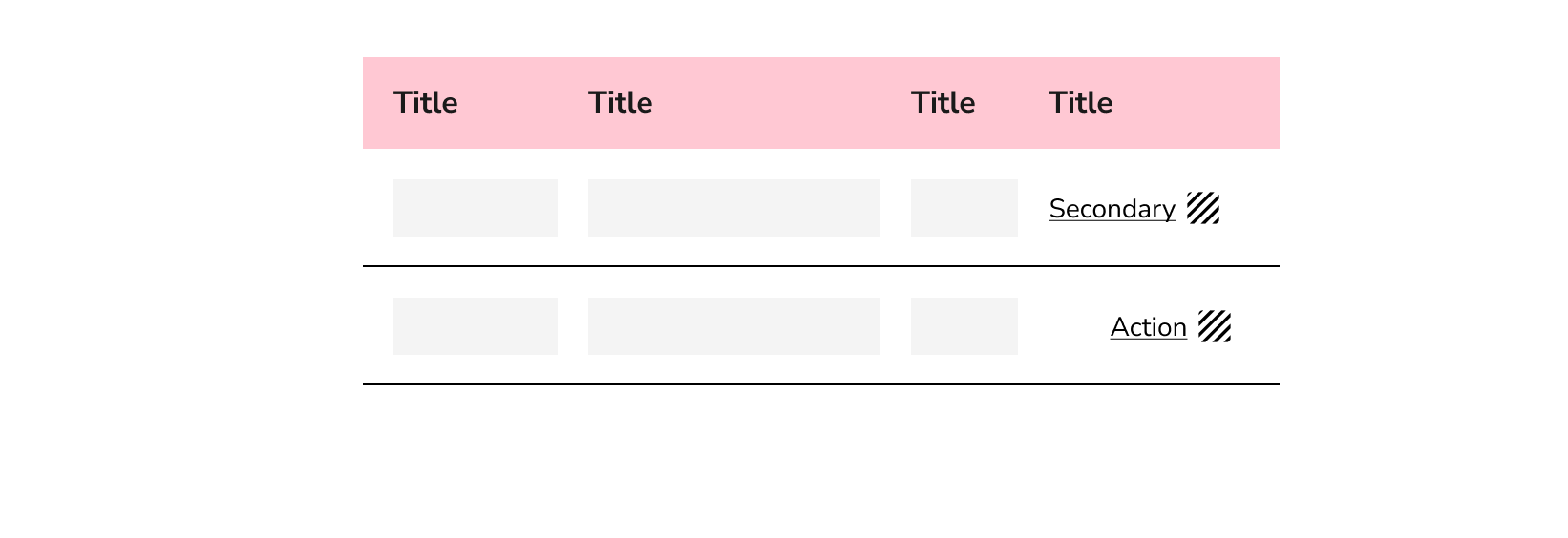
Actions will be aligned to the right.
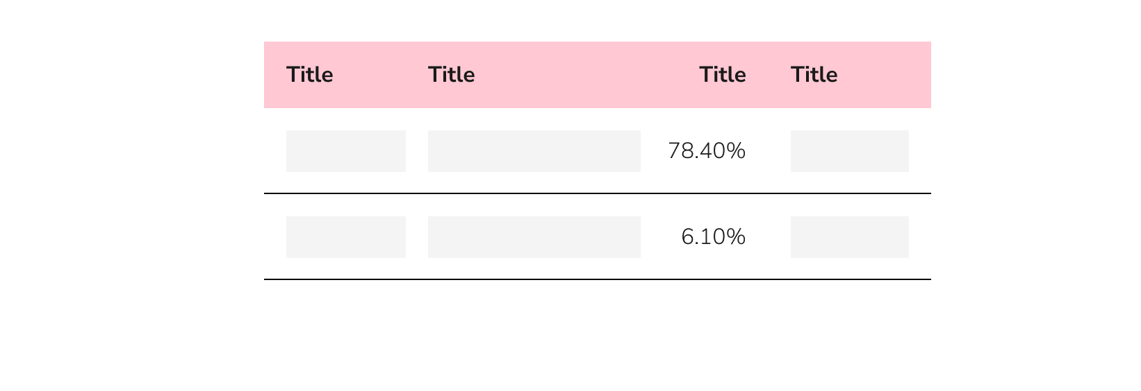
Numeric/percentage/dates columns aligned to the right.
In mobile view, content will show in rows.