
components
Chip
v.1.0.0 | Saturn Storybook
Small elements that represent an input, attribute or action. They allow users to enter information, make sections, filter content or trigger actions.
Components
Play with the component with our playground.
Anatomy
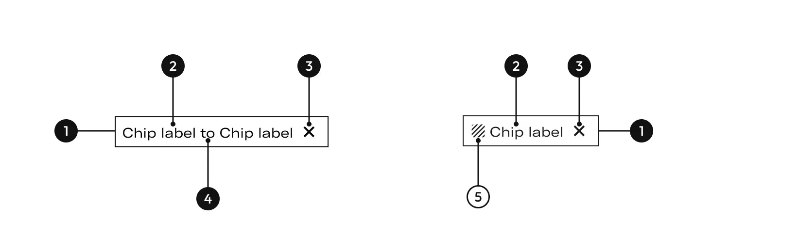
| Name | Description |
|---|---|
1 Required | width height |
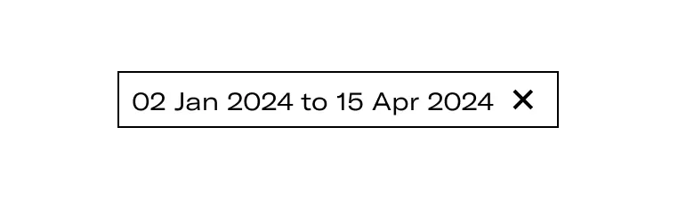
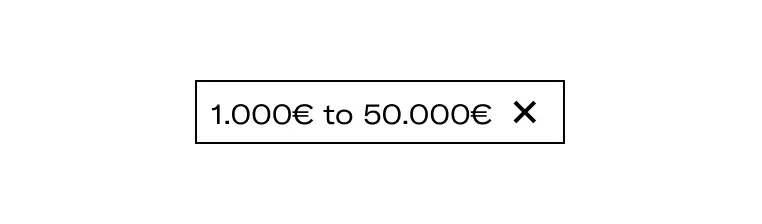
2 Required | The label can represent date range, filters or currency range. |
3 Required | Used to close or removed a chip. |
4 Required | Preposition between titles. |
5 | It helps to quickly understand the meaning of the action. Use only in the Keywords chip. |
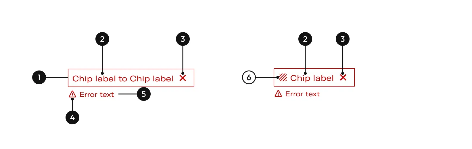
| Name | Description |
|---|---|
1 Required | width height |
2 Required | The label can represent date range, filters or currency range. |
3 Required | Used to close or removed a chip. |
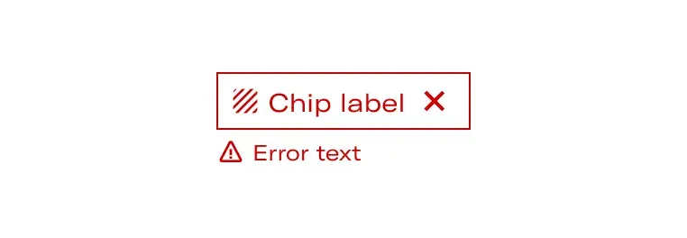
4 Required | The error icon is used to alert the user about an error. |
5 Required | Helps the user to identify the problematic that causes the error. |
6 | It helps to quickly understand the meaning of the action. Use only in the Keywords chip. |
States


Options

Behaviours
- Multiple chips
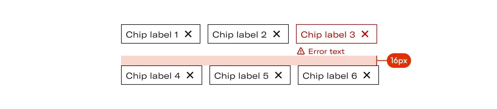
Chip are not automatically discarded. They persist on the page until the user discards them by clicking (desktop) or tapping (tablet, mobile) on the close button. The chips are accumulated one after the other (respecting horizontal padding of 12px ), towards the right side. If necessary, they can move to a second line respecting the vertical padding of 16px.
- Remove chips
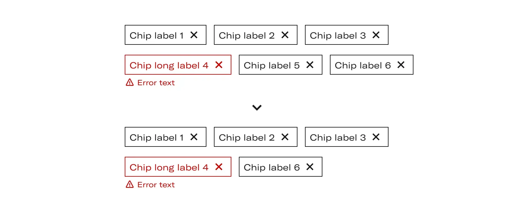
As soon as we close a chip, it disappears from the block and its place is taken by the chip that preceded it. will always readjust from right to left and bottom to top.
Do's and dont's

Labels will always be lowercase.

Chip icons will only appear on 1 keyword chips.

In range chips (whether numerical or date) they may not have icons that reinforce.